Showing posts with label Canberra Museum and Art Gallery. Show all posts

Wednesday, 30 April 2014

Elioth Gruner: The Texture of Light

Elioth Gruner: The Texture of Light
Canberra Museum and Art Gallery, 8 March - 22 June, 2014

Another new Australian painter to me (and probably my mother, whom I know learns about antipodean art through this blog) is Elioth Gruner (1882-1939). He was born in New Zealand but immigrated to Australia as a young child and lived in Sydney for most of his life. Many of his earlier paintings are of beach scenes, full of people, waves and movement.
Bondi Beach (1912)
He was influenced by Impressionism, and through the development of his art, blobs of paint and evident brushstrokes give way to a flatter, broader canvas. I like his groupings of individuals, many of whom can be seen turning to look at the artist with a bold and unapologetic gaze, as though questioning the viewer and making them feel like they are the intruder in this idyllic scene.


The Beach (1918)
detail from The Beach

Elioth Gruner is most known for his texture of light at all times, and in all climates and seasons. His poplars, picnickers and bathers are set against a very Australian environment. It may not contain the reds of the central desert, but the modest, rolling hills provide a modernist take on quintessential aspects of the Australian landscape.


In the Orchard (1920)
In the Orchard, detail
Travelling trough New South Wales and the Canberra region, Gruner painted en plain air, and made his reputation with the Emu Plains series, which he exhibited in the Society of Artists' Annual Exhibition. The magnum opus of this series is Spring Frost, which is part of the Art Gallery of New South Wales collection, and regularly wins audience votes as the favourite painting in the gallery.

Spring Frost (1919)
detail from Spring Frost
Summer Morning (1916)

Gruner 'discovered' the Canberra region in the early 1920s and loved the quality of the light. He was drawn to the quiet grandeur of dry plains and bare hills ringed with ancient mountain ranges. The crisp dry air of the region gives it clarity of light and a sense of distance. I particularly like the paintings of the Murrumbidgee Ranges and Weetangera, because these are the hills I run over, with gold and green fading to blue and grey as sheep graze in the long grass and smoke drifts in the distance.


Murrumbidgee Ranges (1934)

Weetangera, Canberra (1937)
Self-portrait (1915)

Saturday, 11 May 2013

Marking Place: The Lie of the Land

Marking Place
Canberra Museum and Gallery
10 November 2012 - 24 March 2013

Marking Place is an exhibition about landscape and the poetics of place as expressed through the paintings, ceramics and sculptures of three Canberra artists; GW Bot, Anita McIntyre and Wendy Teakel. I quite like a lot of the exhibits, which invite interpretation through abstract forms and tenuous titles.

Anita McIntyre’s untitled paper porcelain, moonprint drawing and screenprint images of fish, shells, seed pods and fossils superimposed over a map of Queanbeyan, Ginunderra, Bengendore and other places of the Southern Tablelands is not especially subtle in its message about human intervention on old timeless land. Her 2011 Song Lines/ Survey Lines is very similar.

Untitled - Anita McIntyre
 
Song lines/ Survey lines - Anita McIntyre
I prefer her stoneware ceramics such as those from the Brindabella series in which coloured strips of stencils or graffiti intersperse on a curved rectangular platter like rows of receding hills in blue, brown, grey and green – the colour of hazel irises – as far as the eye can see?

Brindabella series - Anita McIntyre
I also like the porcelain and millefiori work, Pods/ Fragments/ State Circle (1986), which calls to mind fossils found, but the thin inlaid slices of stone are too uniform for geological shards. The Top End Wet from the Kakadu series (1996) features glazed and woodfired terra sigillata of stoneware in greys, blues, browns and greens as though smudges and blurred with violent rain.

Top End Wet - Anita McIntyre
The Boats series (2012) is a collection of ceramic troughs, like children’s paper boats called Mermaid 1833, Madras 1835, Hoogley 1836, James Moran 1841, Light of the Age 1857, Sirius 1788, Carrier of Family History 1 and Carrier of Family History 2. The boats all have images of fish, nautical calculations and coastal maps drawn on the sides and brief explanations on the insides, such as ‘James Moran 2,900 sheep’ printed in an antique-style font as though torn from a diary but faint and with missing words.

Boats - Anita McIntyre
G.W Bot presents many works in bronze and steel as well as linocuts and watercolour. Broken Garden (2003) looks like a twisted tree, or a fence or a gate, which asks questions of the viewer. Is it growing up, broken down, rusted black or regenerated through fire? A similar ambiguity can be found in Red Gums – Tree of Life (2012), which comprises ten rusted, corroded, gnarled shapes of similar size. Again the viewer can impose their own interpretation on the piece – are these twisted human shapes, animals or molluscs, or perhaps they have a more botanical bent indicating branches, leaves or roots?

Tree of Life - G.W. Bot
These abstract shapes are echoed in a 2000 series of linocuts; Alpha, Omega and Omega 1, in which they are scratches on paper overlaid on another backdrop – the smaller images in the Manuscript series (2000-2001) recall musical rolls for pianolas – pages encrypted with information that transforms into something almost magical.

Bot’s Concertina I, II and III (2012) are large wall hangings of linocuts on Chinese paper, incorporating Chinese motifs and the earlier designs. Here the colour palette is changed to red, black, white, silver and gold, with a patch of green at the bottom referencing both the Australian and Aboriginal colours.

The Long Paddock - G.W. Bot
Glyphs – Lower Molonglo (2010) meanwhile, is gold and white, graphite and watercolour on Colombe paper. The shapes resemble doodles or some unknown font or lexicon in a foreign alphabet. These glyphs are then repeated in many designs, changing meaning with colour scheme and backdrop. In Family portrait at midday they are rendered on a Chinese lithograph; Buried Glyphs (2009) are black and gold with an Egyptian implication; Paddock Glyphs and moon scroll down in red and black on white paper with a blood red disc in the left corner.

Glyphs, Lower Molongo - G.W. Bot
In Tree of Life (2009) bronze sculptures of the previous dashes and symbols are stuck individually to the wall. The Night of the Twelve Apostles (2012) is an interesting work and something of a departure. Like sticks or chair backs, tree-like formations stand at attention with firm foundations before a shining sun/son/halo.
Night of the Twelve Apostles - G.W. Bot
Bot’s final works on display, Entrance No 11/ No 12 (2012) are layers of linocut on BFK paper with tapa cloth and Joss paper. Printed with grasses and stems intact, they are a fusion of many styles of art and complementary materials suggesting a way in to her particular artistic designs and motifs.
The Entrance No. 11 - G.W. Bot
Incidentally, G.W. Bot is the exhibiting name of Chrissie Grishin who was born in Quetta, Pakistan of Australian parents. The family moved back to Australia in 1956 (when she was two), She lives and works in Canberra (having studied in London, Paris and Australia), where she s neighbour to many wombats, an animal she has adopted as her totem. The source for her working name comes from an eighteenth-century French reference to the wombat as ‘le grand Wam Bot’ – hence G.W. Bot.

Wendy Teakel’s work is intriguing. Tracing 1 and 2 (2009) are acrylic and pokerwork on plywood. The slashes on the earth-toned background of ochre, reds and browns look like cuts or stitches in the landscape. Drops of blood, footprints and meeting places are all suggested by this tearing apart and coming together – the dashes and gashes indicating both communication and obfuscation, much like the roundabouts of Canberra.

Tracing 1 - Wendy Teakel
Fallow (1994) is an acrylic and pokerwork on six plywood panels with a bamboozling array of lines and geometric forms. The stripes are golden brown and olive/khaki green – the colours of the earth. The title indicates that they represent ploughed furrows as the land is cultivated leaving certain areas fallow. The cross may symbolise Christianity as it is branded into the land, and perhaps the lines could be opposing forces?

Fallow - Wendy Teakel
Drought (2004) is similar to Fallow, but this time a broken barbed wire fence snakes across the acrylic and pokerwork on plywood. The break occurs in the centre of two panels, begging the question, can it be repaired? The shapes are perhaps firebreaks mown as pathways, or could that be a river with trees dotted on the bank? The title suggests it would be a dried-up river and one wonders why bother to protect it if it is too dry to grow anything? Again the crossroads are a central motif. Is she suggesting we are at one? Exactly who or what is broken, and is it possible to fix it?

Drought - Wendy Teakel
Wind (2005) again defies pat explanations. The concertina-ed materials (listed as wire, grass, acrylic and dirt) are woven and meshed together, with tufts of grass protruding from one end. Perhaps the shape has been formed and eroded by natural elements – it will make an eerie sound in the breeze, rendering it an wind instrument, and there is an inherent suggestion that this may be a boundary, but it is merely symbolic as there can be no protection afforded to either side due to the holes in the structure.

Wind - Wendy Teakel

Bush Track I - Wendy Teakel
Bush Track Bush Track I (2005) and Summer Paddock (2003) all seem to refer to our way of navigating through the land. Blobs and lines of colour, straight and curved indicate furrowed lines of agriculture leaving scars on the land. But these scars have potential benefits as pathways, waterways, contours to be mapped to bring people together and help them find their way.

The sculpture Dry Lake (2010), made from bronze wire, has empty pipes twisted into rings and plugged into the sides of the structure. Failed Crop (2010) comprises similar tortured, twisted shapes attesting to journeys through a barren landscape which is rich if you know where to look and what to look for.

Dry Lake - Wendy Teakel
A couple of rugs, Seed and Grass Scatter and Sand Tracks Murgo (both 2012) are inspired by floor drawings made of sand and pigment. Teakel’s designs were then interpreted and woven by a Nepalese artist at Kumbeshwar Tech School, Kathmandu, in a fantastically successful fusion of cultures.

Seed and Grass Scatter - Wendy Teakel
Late Summer Haze(2012) is a steel, wood, and grass construction – the wooden oval is fringed with branches that appear to have growth lines or ring marks half-way up their trunks and then seem charred, and is filled with fine grass like spun gold. By now I have pretty much lost all my powers of interpretation, and all this thinking has left me fair exhausted, but I just like this sculpture with its apparent bold simplicity.

Late Summer Haze - Wendy Teakel


Monday, 5 November 2012

Australian Portraits 1880-1960 (Part Three)

The portraits of the Forties and Fifties explore the question, 'who am I?' None of these artists made their living by painting portraits. They liked instead to depict themselves, friends, family and colleagues rather than 'important people' from whom they would get a commission. Sometimes they chose disreputable subjects, such as criminals, murderers and outlaws.


Sidney Nolan's Daisy Bates at Ooldes (1950) is a remarkable study of an eccentric character who created her own mythologies. Daisy Bates was most recognised for her work as a journalist and welfare worker with Aboriginal communities. This is an imagined portrait of her in beekeeping gear, in the centre of an expansive and seemingly hostile landscape, with its red earth, hillocks and dead trees. What was Sidney Nolan thinking? Who knows? It's often difficult to tell.

For example, this monochrome version of Ned Kelly (1946) has blurred eyes as if they are shifting too fast to capture. Nolan's more famous Kelly series features the bushranger with a tin hat with the eyes the only things visible, so this is the inverse or the negative. There is no landscape or back story in this posthumous portrait, although the surrounding circle may suggest a noose. The image resembles a photo of Ned Kelly when he was aged 18.

 The Head of a Soldier (1942) is a Dali-esque portrait by Sidney Nolan of a man with bloodshot eyes in an Australian army uniform. The model was Captain Bilby, Nolan's commanding officer. Nolan tried to avoid the army but ended up serving between 1942 and 1944. He depicted the soldier stripped of any form of identification, and the portrait lays bare Nolan's strong personal reaction to Australia's involvement in the war.

Man's Head by Albert Tucker is a portrait of a man in a collar-less shirt, with a crooked, craggy face, wiry hair and fleshy lips. Tucker used his art to convey his anger and distress at the darker aspects of humanity, either through social-psychological landscapes, or portraits such as this one based on newspaper photographs of criminals. This man was charged with kicking a small dog to death.

His portrait of Sydney Fox (1946) is an eerie, psychologically disturbing image. The lop-sided lazy eye, the smooth sallow skin, and the blue and yellow hues suggest bile, anger and depression.

Sydney Fox was an English serial killer who murdered his mother in 1929 in an attempt to obtain money from her life insurance policy. At the age of 31 in 1930 he was the last man hanged in Maidstone Prison, Kent. This portrait is based on Fox's police photo.

Jude Rae's Interiors (1956) is a series of portraits of  fellow Canberra artists with their eyes closed to negate the aphoriosm that eyes are the windows to the soul. The subjects, by closing their eyes, render themselves vulnerable, but they are also complete in their interior world. This art-work is quiet, reflective and poetically intense.

The Girls at School (1959) by John Brack is odd. Three girls in their gingham dresses and school cardigans stand against a brick wall, one holding a bunch of daisies. Their neat hair, pulled off their face and tied back in pig-tails emphasises their flat faces and slightly down-turned mouths.

Brack was a skilled draughtsman and master of composition. He depicted his daughters in a bold, stylised way, by limiting the colour palette as if in a sepia photograph, and by flattening the frame.

It's quite a disturbing finish to the exhibition, and suggests that these Australians aren't all of such a cheerful, sunny disposition as many of us have been led to believe!


Wednesday, 31 October 2012

Australian Portraits 1880 -1960 (Part Two)

Moving on to The Modernists 1920 - 1940.

The artists in this period experimented with a degree of abstraction, a concern with composition, form and colour, and with a shallow picture plane and cool, crisp precision.

Stella Bowen's portrait of Mary Widney (1927) is rendered in bold lines and depicted from viewer sees the subject in a 3/4 profile and also her image from behind as she is reflected in the mirror.
Meanwhile, Grace Cossington-Smith's Study of Head, Self-Portrait (1916) reveals the influence of Post-Impressionism in its high-key palette of pinks, blues, greens, and animated brush strokes.

My new favourite artist is Nora Heysen - ok, she's been around for a while, but she's new to me. I love her London Breakfast (1935) as she sits in her dressing gown, hunched forward over the paper with a tea-cup in hand and the breakfast things still on the table. It's gentle and soft but somehow still honest as I imagine her taking a moment to herself before hurrying on with the day.

The boy in the bathing trunks in Elise Blumann's Charles, Morning on the Swan (1935) seems to be almost stepping out of the frame. He has no face but lots of form against the rippling sea. The canvas has a flat, patterned surface, and the broad rhythmic brushstrokes and network of hatch marks are clearly visible.
Margaret Preston's Flapper (1925) is another favourite. The artist has emphasised the flat patterned surfaces of the clothing set against a shallow picture plane. The subject's rosy cheeks and bright expression suggest she is painted as a progressive young society woman, but her homely woollen dress and knitted tights are at odds with the model of the flash bohemian flapper of the 1920s.
Eric Wilson did not clutter his portraits with background detail. All attention is focused on the subject and the meticulous realism of The atist's mother (1937) is almost photographic in its detail. With her hat and coat on, and her gloves and umbrella in hand, she looks as though she is just about to go out and is only delayed by her son's request to pose.

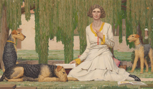
In Christian Waller with Baldur, Undin and Siren at Fairy Hills (1932), Napier Waller has painted his wife sitting on the grass with three airedale terriers, beneath the willow trees with books and cushions. She sits fully dressed in stockings and shoes, playing with her necklace. The wide canvas is full of details to the edges - if this were a photograph we would say it was beautifully cropped.

Christian became a book illustrator and printmaker while her husband became a printmaker and worked with murals and mosaics. In the 1930s he began to work almost exclusively in stained glass and mosaics, using a classical and formal style. This was painted at a time when he was becoming a man of the world while she was retreating into an esoteric religion. Knowing that, there seems to be some distance implied in the portrait.

Roy de Maistre was a pioneer of Australian Post-Impressionism and Abstraction. In his Self Portrait (1945) the central focus is the well-stoked fire, symbolising the belly of the artist, and suggesting a passionate and creative spirit. The bold, flattened forms and intersecting planes show the influence of cubism upon the work.

Albert Tucker, on the other hand, was influenced by the Expressionists, whose strong images responded to the social realities of the Depression - he became one of a group of Melbourne artists known as the Angry Penguins. His Self Portrait (1937) reveals a deeply penetrating gaze, foreshadowing the emotionally charged images he produced in the 1940s. The high forehead, swept back hair, mean scarf over jacket and tie, big eyes, sharp nose, full lips, one raised eyebrow, head tilted forward with chin down but eyes up, all combine to produce the effect of a knowing but quizzical look.

Tuesday, 30 October 2012

Australian Portraits 1880-1960 (Part One)

Australian Portraits 1880-1960
Canberra Museum and Gally, Canberra, ACT
17 August - 21 October

This exhibition promised to contain "a compelling and diverse representation of Australians" including 54 portraits and self-portraits by 34 leading Australian painters. I don't know much at all about Australian art so I am beginning to familiarise myself with it. The exhibition is divided into chronological sections, so I just strolled around, taking notes on the pictures I liked.

Montgomery, Esquire (1885) by Bernard Hall is part of a series of his 'late night images' of his friends. I like the way he sits casually with his leg crossed over, smoking a cigarette, with a drink balanced behind him. His look, however, is anything but casual and is, in fact, almost disturbingly frank - the way things can get late at night...


Seated outdoors, perhaps in a walled garden, the model for Robert Dowling's Miss Robertson of Colac (Dolly) (1885-86) presents quite a different prospect. Although in a relaxed setting, she appears stiff and focused on something beyond the canvas, almost as though she were eavesdropping on a private conversation and completely ignoring the stylised accessories of the Japanese tea service and the spaniel. These may have been added later as her posture and mien suggest absolutely no interaction with them.

I love Tom Roberts' An Australian Native (1888) and can well believe this is a classic of Australian art. In her pink dress/ coat with a bustle and feathered hat, clasping her umbrella before her with both hands, the subject is clearly meant to be a 'type': a young, healthy, vigorous Australian-born woman of Anglo-Celtic descent.
She, in turn, is in contrast to Miss Myra Kemble (1888) by Girolamo Nerli, who is painted with swathes of theatricality. She was, according to the catalogue notes, 'one of Australia's best-loved stage actresses.' Teasing her audience from behind her ostrich fan, we glimpse her coy expression, direct eye and amused mouth. The artist has painted her as if spot-lit on a darkened stage, focusing our attention on her playful character, flair and beauty. His attentive eye has picked out her plush red cloak with intricate detail on the lining, and her ruched water-silk gown with high neck and button and dart detail.

And so we move on to the next section - The Edwardians 1900 - 1920. Apparently many Australian artists of this era spent a substantial amount of their time living and working abroad. Many subjects appear dressed up or acting out roles, as many families commissioned portraits in historical style to give themselves credibility.

I love the Study of Lena Brasch (1893) by Tom Roberts. The artist has used rapid brush-strokes and bold colour, capturing the subject galncing down in her hat trimmed with tartan ribbon or perhaps even shiny bon bon wrappers. The charming combination of auburn hair, pale pink lips and the delicate blush on her cheek make this painting seem alive, although it is incomplete. One almost expects the subject to turn, to look up and burst out laughing any minute.

George W Lambert's Chesham Street (1910) is altogether more serious. This is a dramatic self-portrait in which the subject lifts his shirt to reveal a fairly skinny torso, presumably to a doctor. The blinding white flesh lightens the canvas, although judging from the serious expressions contained in the portrait, it is unlikely to have lightened the mood.

Many artists painted self-portraits because they saved money by not hiring models. This proceedure also allowed them a degree of critical self-analysis and introspection.

In Hugh Ramsay's Self Portrait Bust Showing Hands (1901), his hands are jointed like the wooden mannequins often seen in artists studios. With the long face and aquiline nose, this may equally be a study in antaomy or the effects of light and dark, as his half-smile is emphasised by the shadow cast on his lopsided lips.

Charles Wheeler can also afford to be less than flattering in Apres le bal (1910) in which he paints his self-portrait in a turban; his facial features contorted in an exaggerated yawn.

The full-length portrait of The Boy with the Palette (1911) by Violet Teague is of Theo Scharf, who at this time was a child prodigy. He betrays a nonchalant stance in his dark polo neck, long shorts, and knee-high socks. With his supercilious expression, his eyes really do follow you about the room, while never looking directly at you. He appears to be looking down on you with a sneer.

The artist has totally captured his assertive gaze and conveyed his confidence in himself and his artistic talents.

Bright colours against a studio background capture the attention in Max Meldrum's Poland (Madame de Tarczynska) (1917). The subject is dressed in traditional costume which seems more important than her strong but ill-defined features.

Meldrum was an adherent of the tonalist theory which maintained that the contrasting light and dark was the most important component of a painting.

E Phillips Fox takes a more impressionist approach with The Green Parasol (1912). Luminous colour abounds in this portrait of a seated woman in a green dress and parasol with a small black dog on her lap. Her auburn hair and the flowerful garden enhance the sensuous and stylish work celebrating light and colour. The warmth of the dappled, diffused afternoon fairly spills out of the canvas.

George W Lambert's Weighing the Fleece (1921) is another classic to behold. It is painted as a tableau with focus on the structure and pattern. The men are engaged in business  (with a record-priced fleece being weighed) while a woman sits casually on a woolsack. One sheep is shorn while the other stands by beneath a heavy fleece hinting at further riches. The painter has captured minute details such as the brand on the wool bale and the swallow droppings on the beams, while the overall projection is one of wealth, success and good fortune.