Showing posts with label design. Show all posts

Thursday, 8 January 2026

Shield Design


As stated in my previous post, we kicked off the new year with a Medieval-themed party (as you do) in which one of the challenges was shield design.

Him Outdoors and I provided the shields (we had made them from cardboard and spray-painted them in background colours) and various craft supplies, and the contestants had to make up a shield. I had previously sent out a link about basic heraldry in case anyone wanted to hone up on knowledge; there were points for the design itself and the acompanying wiffle-waffle. Here are some examples.

The Luminosity with shield
The Luminosity created this powerful depiction of her family crest with swirly designs, ribbons and sheep. It's bright, expressive, and with personal significance. The next design to feature was also yellow and made reference to the holder's title or family name, but maybe not so much of a crest.


Although hard to see in this image, the design on the right features hand-drawn crucifixes, two upright and two upside down, intermingled with smiley faces, to highlight the ridiculous attempt to force religious conformity onto the medieval peasant class who were just trying to get on with their daily lives. The one on the right scored highly with the judges as it indulges the inner child and playfulness through smiley faces, googly eyes and cartoon animal characters. The use of the ribbon, pom-poms and jingly bells also adds to the tactile nature and auditory sense of fun. 


Here we have the importance of description. The very simple design - a single white ribbon and two butterflies belies a complex explanation of the shield representing two parts of the bearer's life: England (the faded quarter from the past) and Australia (the more vibrant three-quarter section at the top in the present). The white ribbon represents a contrail in a blue sky as the transportation occured, and the butterflies indicate the physical transformation.


The explanation for this one is from someone who had clearly read the basic heraldry guidelines so I shall let them tell it. 

A background of GULES (red) symbolising the fiery nature of the bearer. 
An ORDINARY CHEVRON of SABLE almost equally bisecting the shield indicates affinity with justice and equality.
Une abeille OR et SABLE (the gold/ black bee) RAMPANT surrounded by two bees GUARDANT indicates both a watchful nature and teamwork quality. 
Three charges of googly eyes SABLE and ARGENT speak to watchful yet playful characteristics. 


Some challengers went with all the things that are important to them. Hence Purple Lady with images of romance, theatre, family, work, leisure activities and cats. Meanwhile others went with the 'white tears of Henry Cockington' in a design that was very much a single entendre. 

Purple Lady with shield
Henry Cockington
There were blatant appeals to judges with the combination of Liverpool and Burnley football club crests, and a Shakespearean pun, 'a plague on both your horses', involving unicorn heads and coronavirus bobbles. Also (pictured in the group image but no individual photo) was a delightful interpretation of chaos (cats; eyeballs; jingly bells) and the unknown (blank space) summing up that bearer's identity.

Original Gravity with a blatant appeal to the judges
A Plague on Both Your Horses
And the winner was... Gindelle with her thoughtful piece reflecting growth (a tree image), transformation (an origami butterly) and the family foundation of her last name in a replica Lego block. Congratulations to all for the (various levels of) effort, fun and creativity!

Gindelle with the winning shield design

Tuesday, 2 April 2024

Quilts at the Canberra Show


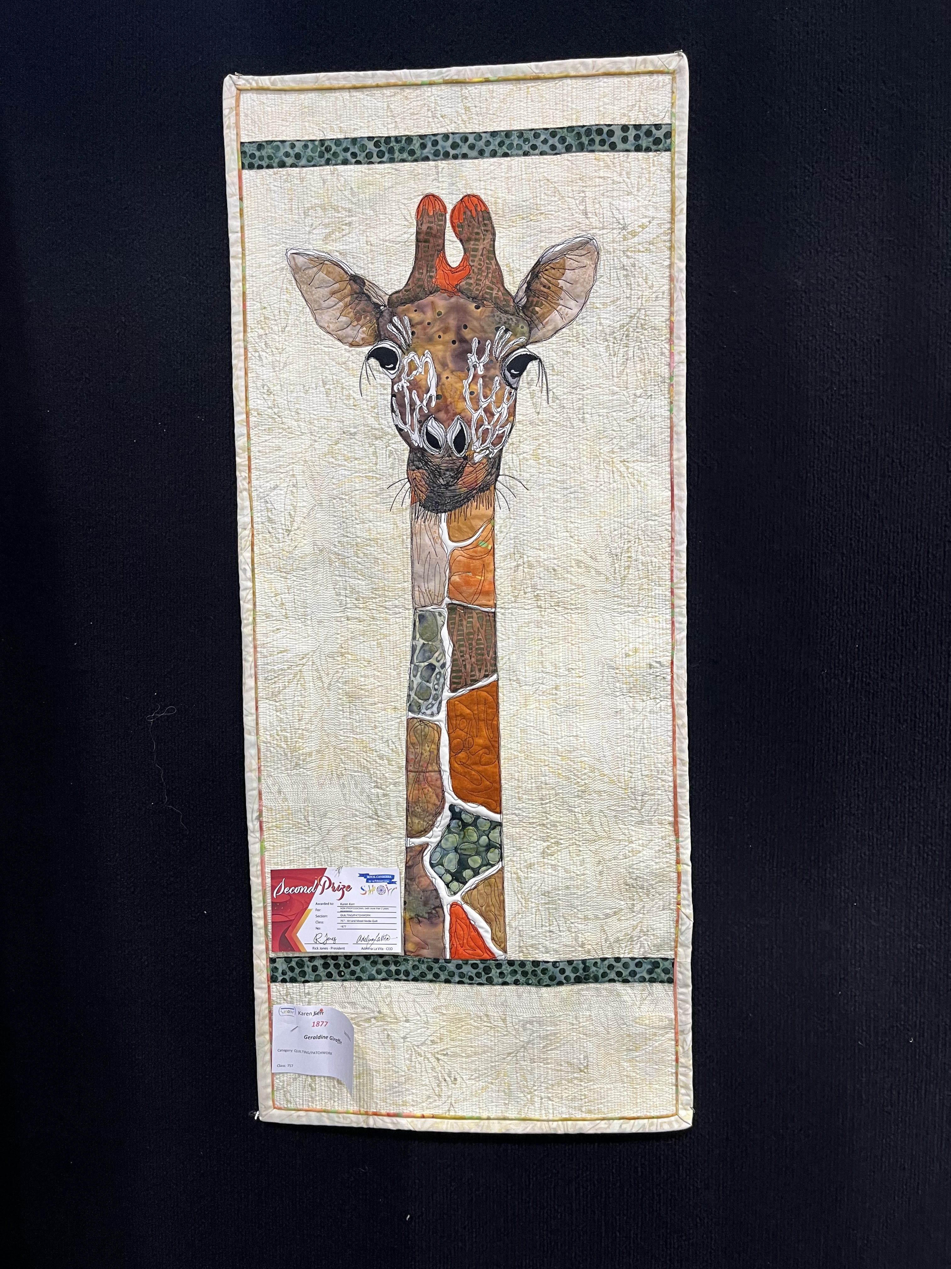
Last month we went to the Royal Canberra Show. There were many impressive items on display, but I felt the quality of the quilts deserved a post of their own. I love the colours and the shapes; the design and the intricacy.


I also know the hours of work that goes into making them, and I like to think that people stitched them while sat around with friends, listening to music or podcasts, or enjoying solitude and a beverage of their choice.


Of course, I have a soft spot for the cats, but in the interests of fairness, I should include the dogs too. And the giraffe is just gorgeous.


The abstraction and the palette chosen are fascinating. Yellow seems a popular choice for happiness as in the sunflowers, but it also lends a confident golden glow in some of the bolder designs.


It's fascinating to see these quilts as a historical record, whether it be of ancient Egyptian culture or the more recent late Queen ELizabeth II. 

Monday, 19 February 2018

'Above all things, avoid vagueness'


William Morris: A Life for our Time by Fiona MacCarthy
(Faber & Faber), Pp. 800

This is a massive book, because Morris was a great man. He has done so many things with his life, being a poet and novelist; print maker; designer; weaver; Socialist; reformer; speaker, and described as ‘the greatest artist-craftsman of his period’. Fiona MacCarthy has a huge job on her hands to capture the vibrancy and energy of the man on paper, and she does it well and thoroughly, as this is researched from letters, diaries and memoirs of Morris himself and those who knew him. Educated at Oxford and destined for the cloth, Morris gave up the priesthood (and, later, architecture) to make and produce things. “To Morris the idea of work became equated with creative vigour and directness: a mental and manual effort resulted in the actual production of a carpet, a story, a translation of The Iliad.”

The Oxford intelligentsia at the time was obsessed with poetry (Tennyson in particular) and the Arthurian cult. Morris and his great companion, Edward Burne-Jones laid their own claims on the Arthurian myth, with Morris writing verses and Burne-Jones dwelling on themes of the San Graal in his paintings and tapestries throughout his life. “Arthurianism, as Burne-Jones and Morris saw it, was not merely an intellectual exercise. They fell upon it as an extension of religion, adopting the chivalric as a rule of life.” Morris loved the idea of a fraternity and felt the importance of the brotherhood; a group of men with chivalric codes. “If Morris had a need for the intimate companion he had an even stronger yearning for the group.”

King Arthur and Sir Lancelot, stained glass panel designed by William Morris 
One of the celebrated members of this group was Dante Gabriel Rossetti, who later went on to have an affair with Morris’s wife, Jane (née Burden). MacCarthy doesn’t shy away from the affair, but neither does she dwell upon it in any length. Indeed, the relationship between Jane Morris (or Janey as she was known) and Rossetti seems slightly sordid and not even very interesting; in their correspondence they are “intertwined in illness, in solicitous inquiry, exchanging news of treatments: theirs was hypochondriac passion, taken to extremes.” Janey was a constant invalid, as Victorian women often seem to have been. Morris, although clearly uncomfortable with the arrangement, never sued for divorce which suggests sensitivity to Janey and their children rather than any wilful ignorance.

“It was while he was at Oxford that Morris’s wild temper began to take on the quality of legend. In these rages he was accredited with superhuman strength.” He used to head-butt walls, bite through window frames, lift up heavy weights in his teeth and beat himself about the head in fits of masochism. He became the butt of jokes; the comic character; the basis of a legend. He was mocked for his size and appearance, his rages, and his wild hair and beard – the rest of the group nicknamed him Topsy. Burne-Jones and Rossetti drew caricatures of him, which are partly affectionate, but they are also a little cruel. Morris payed along with the joke, “But it would be difficult for somebody as sensitive as Morris to withstand unscathed such a long barrage of ridicule. It must to some extent have damaged his self-confidence, especially with women, and intensified his feeling that he was the outcast, even in his own close group.”

The M's at Ems by Dante Gabriel Rossetti
Although he is now remembered more for his manual creativity, he was a prolific novelist and poet. He wrote The Earthly Paradise as his homage to Chaucer and the English tradition of ceremonial story-telling. This is the “vast narrative that was to make him, for a decade, the most popular poet of his period and eventually put him in the running for Poet Laureate in succession to Tennyson.” The women in Morris’s novels are strong characters who are guided by their own sense of value and self-determination. He writes of utopian themes where people live together without false hierarchies and are fully committed to the work they do. He enjoyed the minutiae of life and believed more care should be taken over individual duties.

Perhaps his most influential stamp upon the world, however, was his approach to craftsmanship, visible in his designs for everything from tapestries and textiles to wallpaper and bookplates. The earliest of his wallpaper designs are of fruits and flowers with a fluid sense of movement. “They are gentle flowing patterns which show Morris’s belief in the purpose of pattern to impose a rhythm, to soothe and civilize.” Designs such as ‘Rose and Thistle’, ‘Bird and Anemone’, and ‘Brother Rabbit’ are complex, finely detailed and confident designs. They are “very English in their range of reference, their observation of the life of the hedgerows, their fondness for the sleek, evasive creatures of the woodlands, but also clearly influenced by Morris’s study of historical textiles.”

Brother Rabbit design by William Morris
Morris’s attitude to manufacture and design is what really sets him apart from his fellow craftsmen. He famously said, “Have nothing in your house that you do not know to be useful or believe to be beautiful” and this was an adage he brought to his work and artefacts. Steadfastly against art only for the few, Morris maintained that all could be taught the ethics and the practice. In his first public speech, The Decorative Arts: Their Relation to Modern Life and Progress (1877) he proclaimed, “I do not want art for a few, any more than education for a few or freedom for a few.”

He visited Iceland on a number of occasions and kept detailed diaries, which MacCarthy mines for clues as to his future Socialism. She believes the trips had a profound effect on his art and politics, and he declared, “That the most grinding poverty is a trifling evil compared with the inequality of classes.” It seems inevitable that Morris should have been drawn into politics, and he embraced Socialism and toured the country speaking at rallies and promoting the cause. He revelled in being given a task and an active purpose. He kept a diary of his findings and experiences, and never became hardened or inured to the inequality, appreciating that it was his only good luck which made him born prosperous. Reminiscent of George Orwell, “He travels around England with such great reserves of stamina, watchful and concerned, but never sentimental, recording the depressing details of the scene.”

William Morris (right) with Edward Burne-Jones
William Morris was not optimistic about the future of culture which he felt was being destroyed by rampant consumerism and global greed. He wanted to “transform the world with beauty” and felt that if he succeeded in “some small way, in only one small corner of the world” he would count himself blessed. His enduring influence must be taken as a measure of his success, but as he said himself, “the work goes on”. It does, indeed.

Monday, 4 January 2016

Body Art

More than a Body: Organic Perception
Fredrika Rose

Tuggeranong Arts Centre

This exhibition from last year features watercolours, sculpture and installation by Fredrika Rose, winner of the 2013 Emerging Arts Support Scheme (EASS) Award.


Her work explores biological aspects of our lives, such as a print which resembles a wallpaper design of imaginary bacteria as if seen through a microscope. The colours and intricacies drip bodily fluids and reveal natural features such as mountains, flowers and rainbows. The juxtaposition of the earth's grandeur with the minutiae of cellular activity draws parallels between botany and biology.


Some of the pieces explore the self-destructive capacity of the human body, such as these pieces incorporating silk, human hair and alpaca hair. The positioning of the three items recalls the ceramic flying ducks favoured of interior decor of certain demographics. Rather than being comforting and homely, however, the installation has connotations of hatching eggs and aggressive cancerous growths.


Fredrika likes to challenge the viewer by contrasting the weird and fantastic; matching dark humour and shocking spectacle. Dressing up animal skulls in pearls and feathers is a heightened memento mori reminding us that all beauty must die, but that organic adornment will transform into alternate energy. In other words decomposition is creation. It's an intriguing concept.

Other sculptures are made from medical accoutrements, such as colostomy bags and drips, coiled on themselves and arranged to resemble a bunch of flowers. The artificiality is pronounced and obvious, but the human mind likes to interpret inanimate objects naturally.


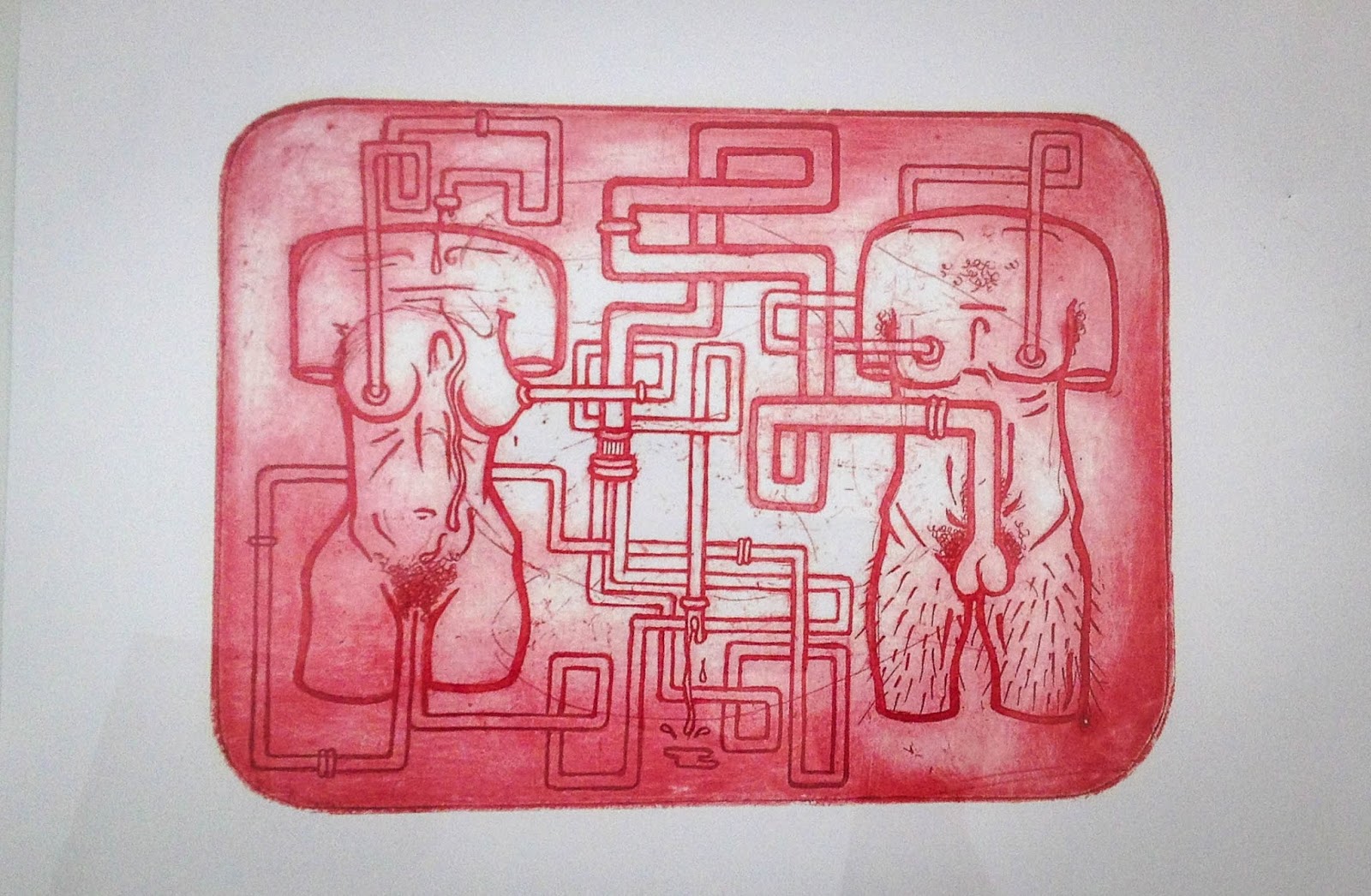
Other aspects of her work in this exhibition are blatantly physical, which both attract and appall. The surreal style is simultaneously playful and voyeuristic bringing curiosity to a corset-styled torso, or a technical design inspired blueprint for human plumbing.


Plumbing
Her artworks are often surrealist in style, but she can also draw Michelangelo- style anatomies when she wants. Even in these, however, her restless curiosity is apparent.

Tuesday, 26 August 2014

Blind Lines

In the morning when the sun slants through the blinds to cast shadows in my bedroom, I feel as though Gordon Walters has painted my wall.

Modern abstract design by Gordon Walters

Tuesday, 2 July 2013

My Newest Favourite Thing: Veronika Maine

I don’t like clothes shopping. By which I mean I don’t like shopping for clothes. If clothes want to shop, that’s fine by me, although perhaps unlikely. According to popular mythology, women love shopping. Sigh. Another way I don’t fit into your boxes.

The first problem is me. My top half and my bottom half are different sizes, which means I can’t easily wear dresses. Apparently if you are over a size twelve anyway, all should wear is black so you can scuttle about your business and return to your house as unobtrusively as possible. Designers don’t want you to be seen in their clothes – heavens; it might suggest there are real women out there, and the sky might fall.

The second problem is the clothes. They are usually badly-made and ill-fitting with shoddy stitching and insufficient lining. My grandmother was a seamstress. She would take the garment between thumb and finger, examine the material and the make-up and then tut loudly and pronounce, ‘Shabby’. It was an experience that to witness was to wither. Many shop assistants are probably still in therapy.

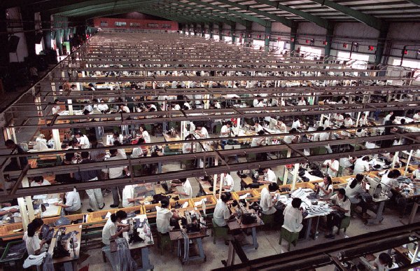
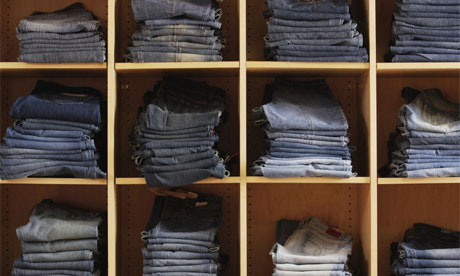
The contribution of high-street fashion to slave labour and sweat shops makes me sick. Certain shops proudly trumpet the fact that they sell jeans for $15. You can bet they have a hefty mark-up on these items, so they are probably purchasing them for $5 or less. That price will include transport from China or Bangladesh or the Philippines or whichever country’s impoverished workforce we are currently choosing to exploit. Slavery was abolished in Britain nearly 200 years ago, and the Universal Declaration of Human Rights banned slavery globally in 1948.


By turning a blind eye because I want cheap jeans (and who doesn’t? I haven't got much money and I certainly can't afford top-end designer gear) I am perpetuating this system. I am not supporting my local economy, manufacturers or designers, and therefore am contributing to the current downturn with its inherent erosion of workers’ rights and might as well vote Tory. I buy Fairtrade, organic and free range products wherever possible and have never illegally downloaded artistic creations. To purchase unethically would betray my principles and yet buying clothes seems to leave me with strictly limited options.

The third problem is the shops. Loud music; fluorescent lighting; confronting changing rooms; neurotic thermostat controls; and as for the staff… It’s really not their fault; they are there to sell and I suppose they get a commission. There is no other excuse for them foisting items onto you that you clearly don’t want or suit and then telling you that they look great on you when you know perfectly well they make you look ghastly but you have been battered by the onslaught of rampant consumerism and you don’t want to look like a failure by leaving the shops with nothing – it is tantamount to admitting you are misshapen and hideous and will never fit in with the thin and pretty people – so you buy something you will never wear and still have achieved nothing through the whole rigmarole except a feeling of self-loathing and an inability to pay the heating bill, and, what’s more, you will have to do it again because you still haven’t got a pair of jeans that fits... And breathe.


Enter my damsel in shining armour: Mim at Veronika Maine. She does not laugh at my size, or make me feel bad about being big. She asks whether I want colour and what styles I would prefer. She recommends things that actually fit (and are well made), and doesn’t seem to mind if I don’t take everything and spend a fortune. She understands my ethical concerns and discusses them with me. The shop is part of a group that is 100% Australian-owned and employs local designers. Almost everything is made in Australia and the organisation works closely with the Textile Clothing and Footwear Union of Australia (TCFUA) to ensure rights and working conditions are honoured. How often have you been confident that the retail assistant in the high street would even know those details, let alone be proud of them?

And the changing room is spacious and pleasant. I leave the store with two pairs of jeans that fit, that aren’t outrageously expensive (but I know that the price I paid means that the people who made them received a decent wage or doing so) and that I know I will wear and be happy with. I also have a good feeling about my ethical consumer choice. For once, I have had an enjoyable shopping experience. Honestly, why would I shop anywhere else?

Monday, 17 December 2012

Canberra: An Ideal City?

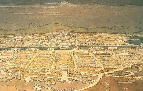
Commonwealth of Australia Federal Capital Competition - Griffin winning entry
The restored pictures of Marion Mahoney Griffin's artwork for the design of Canberra are on display in the cafe at the National Archives and they make a fabulous backdrop to a chai latte. She and her husband, Walter Burley Griffin, won the design award for Australia's capital and it is thanks to them that Canberra looks largely the way it does.
"I have planned a city not like any other city in the world. I have planned an ideal city - a city that meets my ideal of the city of the future." - Walter Burley Griffin
View from Summit of Mt Ainslie by Marion Mahony Griffin, 1911
The information panels point out that Marion's renderings were infused with sepia and gold and captured the colours of Canberra's landscape. This is all the more remarkable as she had never been to Canberra and instead made the drawings at her home in Chicago in winter 1911. Doubtless she took into account Walter's effusive comments about the light.
"The morning and evening lights at Canberra are wonderful. The shadows of the clouds and the mists as they cross the mountains are very beautiful indeed."
City and Environs - the Griffin plan for Canberra, 1911
Marion Griffin was one of the first licensed female architects in the world and is considered an original member of the Prairie School (of whom Frank Lloyd Wright is the most famous proponent). She and Walter were also greatly influenced by the City Beautiful and Garden City movements. Lacking the cultural history, artefacts and monuments of Old World capitals, the Griffins’ Canberra showcased nature instead. They incorporated the local topography into their triangular design, using the feature hill - Kurrajong Hill (now called Capital Hill) - as a natural apex.

"I think in a new country like Australia, a beautiful architectural type adapted to the needs of the climate, and harmonising with the topography can be evolved. I believe in architecture that is the logical outgrowth of the environment." - Walter Burley Griffin
The Griffins complemented their landscape design with an architectural scheme for the city. Although they worked on the design together, and Marion provided all the artwork, the competition entry featured only Walter's name. Walter negotiated a three-year contract with the Australian government to remain in Australia and oversee the implementation of the plan. He felt, however, that it was compromised and he struggled with political and bureaucratic obstacles. With the outbreak of World War I in 1914, Griffin was under pressure to reduce the scope and scale of the plans due to the Government diverting funds towards the war effort.

Vision of Parliament House by Marion Mahony Griffin
The pace of building was slower than expected, partly because of a lack of funds and partly because of a dispute between Griffin and Federal government bureaucrats. The design also came under attack from other architects and the press. Rather than just adhering to the plans and the previously-made commitment, a Royal Commission determined that they had undermined Griffin's authority by supplying him with false data which he had used to carry out his work.

There was clearly a lot of rancour and Walter Burley Griffin resigned from the Canberra design project in December 1920. Many parts of his basic design were changed, and none of the buildings he designed for the capital were ever built.

Monday, 12 October 2009

Natural design


As I was sitting on the village green today eating a cornish pasty, these delightful leaves fluttered down from the trees. I don't know what they are but I think they are gorgeous and I stopped to gather a handful. A small child cycled past on his tricycle and asked his mother, 'What is she doing?' The mother just looked bemused.

If I were a designer like Tamsin Coooper, I would embroider them onto fashion accessories. They would look adorable on brooches, hair-ties or coin purses.

If I were an artist, like Andy Goldsworthy, I would make some amazing temporary art-work with their tiny forms. The way they studded the grass was remarkable, and I'm sure they could be worked into a spiral or a heart or some other intricate construction.


I love the little red centres in the fragile green hearts. I think they would make amazing handmade paper for wedding invitations and the like.

But I don't have these sorts of skills. I think of the ideas but can only admire others for their practical implications.

So I look and I take pictures and I imagine. And all of these imperceptible pleasures make me happy.