Friday 20 September 2013

Friday Five: Ugly Animals


Proboscis monkey we saw in Borneo
 No, no, no, I simply won’t have it. Two of my favourite animals have made the top five of the ugly animals list. New Zealand’s beautifully useless kakapo was named the second ugliest and the fabulous Proboscis monkey (with whom I fell in love in Borneo, and whom I believe bears a certain resemblance to someone I love dearly) came in at number four.

The list was compiled by the Ugly Animals Preservation Society which considers it unfair that fluffy pandas and cuddly polar bears get all the attention when other equally endangered animals are ignored because they aren’t so photogenic. This is a worthy cause, but I question their choices (although the blobfish, which tops their list, really is repulsive-looking). So I have made up my own list, and it’s true that fur generally wins in the cute race.

5 Ugly Animals (in my opinon):
  1. Human babies – come on; what’s attractive about a bright red bald screaming thing?
  2. Warthogs – need I say more?
  3. Those hairless dogs with whiskers (Chinese crested) – bald cats are none too attractive either, to be fair.
  4. Naked mole rats – they are extremely ugly but highly desirable for scientists since it has been discovered that they don’t get cancer.
  5. Cockroaches – so revolting they may be the only animal I would willingly kill if I could, although they are practically indestructible. And their larvae are repulsive too.

Thursday 19 September 2013

Sides of Bacon: 3. Back

Francis Bacon: Five Decades
Art Gallery of New South Wales
17 November 2012 - 24 February 2013

Three Studies for Portrait of Isabel Rawsthorne
Frnacis Bacon embraced the triptych form, which gives many of his portraits the sensibility of mug shots with their front and two profile aspects. This was a format popular with devotional works and Christian altarpieces, which Bacon subverted, placing the secular (and what some considered ‘deviant’ images of homosexuality) in a religious arrangement designed to shock. This stylistic device also allowed him to construct a narrative through consecutive frames. Of Three Studes for Portrait of Isabel Rawsthorne he wrote “What I want to do is distort the thing far beyond the appearance, but in the distortion to bring it back to a recording of the appearance.”

Many of his triptychs are of George Dyer as he appears to work out his grief and anger on canvas. Three Studies of Male Back (1970) reveal a man reading or shaving reflected in a mirror, except in middle picture the mirror is symbolically a dark void. The figures in Triptych (1970) echo earlier themes of wrestlers but now the protruding spine points to vulnerability and the swinging hammock with distorted shadow and no background highlights loneliness and isolation.

Three Studies of male back (1970)

Triptych (1970)
Triptych (August 1972) seems to be a memorial as the figures on the outside are seated on a wooden chair while the one in the middle is in a foetal position. The flesh melts in puddles of pink and lilac, representing life flowing out of the body as shadows seem to escape from the figure.

Triptych (1972)
Bacon’s paintings of this period often feature mirrors and we see backs of heads and people examining themselves. He was also keen on radiology in this era, with its textbook blue circles pinpointing internal workings. In Triptych, 1973 there is an element of self-portraiture, of a figure looking critically at himself, at who and what he is. He examines his bodily functions (defecating and vomitting) and his inner demons. He claimed, “The sitter is someone of flesh and blood and what has to be caught is their emanation” but he often portrays his figures as though through glass tables with pornographic and sadomasochistic overtones.

Triptych (1973)
By the 1980s the sense of chaos and drama is replaced with a more sober control. Most of his friends were dead, and his paintings have become flat yet vibrantly coloured with solid, fleshy shadows. By 1987 the Triptych reveals bullfighters’ wounds as if seen through a blue window against a bright orange background.

Triptych (1987)
Francis Bacon’s work is puzzling both figuratively and literally. Confusion is created by his use of generic titles, renaming paintings with different titles, destroying of canvases, and inability to predict how many pictures he will exhibit so they cannot be included in a catalogue but arrive at the gallery with the paint still wet. Pictures of his studio reveal an overwhelming muddle and yet he insisted plaintively, “I work best in chaos”.

Perry Ogden's photo of Francis Bacon's studio


Wednesday 18 September 2013

Sides of Bacon: 2. Middle

Francis Bacon: Five Decades
Art Gallery of New South Wales
17 November 2012 - 24 February 2014

Study for Self Portrait (1963)

In the 1960s Francis Bacon seems to have turned his attention to portraits, although they are not always flattering, or even recognisable. He claimed, “In trying to do a portrait, my ideal would really be just to pick up a handful of paint and throw it at the canvas and hope that the portrait was there.” He used flat, high key colour used to frame and isolate, with a few wild strokes and turns of the brush to create detail.

His 1963 Study for Self Portrait is a study in distortion; he is trapped by a blue sofa and his eyes are hollow sockets. The sofa makes a reappearance in Portrait of Henrietta Moraes on a blue couch (1965). A transfigures shape reclines on a blue sofa, barely covered with a white sheet and a strong suggestion of blood. Behind her a naturalist door opens onto a dark void, with all manner of possible interpretation – none of them pleasant. According to her obituary she was, ‘foul-mouthed, amoral, a thief, a violent drunkard and a drug addict. Yet she was witty, wonderfully warm and lovable.”

Portrait of Henrietta Moraes on a blue couch (1965)
His use of blocking and perverting the colour wheel (thirds of red, orange and purple like a geography teacher’s wardrobe) are startling in From Muybridge: the human figure in motion; woman emptying a bowl of water; paralytic child walking on all fours (1965). Eadweard Muybridge was an English photographer known for pioneering motion series, and this work suggests a 3D model with moving figures.

From Muybridge (1965)
The Portrait of George Dyer in a Mirror 1967-68 shows Dyer, Bacon’s lover, sitting in what looks like a swivel office chair, his disembodied face, split down the centre, reflected in a lectern-like stand. On the painting are two splurges of white paint splashed across the surface reminiscent of semen defacing the image. Whether this indicates rage, lust, or possession, it is highly confrontational to the viewer. In 1971 Dyer committed suicide in a hotel room on the eve of Bacon’s major retrospective at the Grand Palais in Paris.

Portrait of George Dyer in a mirror (1967-68)
At first glance, Lying Figure (1969) reminds me of a fried egg in a skillet – the colours correspond. On closer inspection it is a naked female figure, Henrietta Moraes, splayed on a bed with a syringe in her arm and drugs on a sideboard. There is more than a suggestion of violence and the ‘nailed to the wood’ parodies the crucifixion. The position of the model, bleak light and floating bed hint at a dissection on an operating table or perhaps another type of theatre, dramatically arranged to resemble an artist’s palette.

Lying Figure (1969)
In later works, Bacon introduced props such as umbrellas and cricket pads. Seated Figure (1978) is a depiction of George Dyer with these symbols. The triptych Studies of the human body depicts three versions of a (headless) woman on rail or tightrope with an umbrella for possible balance. The lean minimal composition highlights a writhing, convulsing figure on a clean ground of flat colour. And Figure in Movement (1985) focuses on a faceless batsman ready for action. Bacon refused to explain the cricket pads but merely said he acknowledged the importance of the game to the British psyche and coyly added that he was interested in sport of all types and the male form in action.

Seated Figure (1978)
Studies of the human body
Figure in Movement (1985)

Tuesday 17 September 2013

Sides of Bacon: 1. Streaky

Francis Bacon: Five Decades
Art Gallery of New South Wales
17 November 2012 - 24 February 2014

Crucifixion (1933)
 Artists are often lauded for capturing the zeitgeist and being representative of their time. Francis Bacon, however, was decidedly not of his time, resisting movements such as abstraction and drawing for ideas on a hodgepodge of sources from other artists (such as Velasquez, Picasso and Van Gogh), cinema, Nazi leaders, media images and religious iconography. Despite this, he managed to produce a profound impression on later artists including Brett Whiteley and Damien Hirst, and is considered by many critics to be the greatest British artist since Turner.

Contemporary thinking suggested that for art to be meaningful, it had to be abstract, but Bacon was fascinated with the human form and with flesh. His figurative compositions are still bold, confronting and intense. The exhibition of half a century’s work opens with Crucifixion (1933), a ghostly black and white depiction of a human form with an X-ray quality. Less a spiritual symbol than an emblem of human brutality and suffering, this manipulation of the human form, inspired by Picasso, is a recurrent theme throughout his art.

In the 1940s and the final years of WWII, Britain was shattered by profound violence and destruction. Bacon was excused from active military service (due to his asthma) but worked for the Civil Defence. He paints many screaming figures, gasping for air, crouched beneath umbrellas or enclosed in cage-like structures and claustrophobic boxes. Much has been written about the symbolism of the scream; is it a cry of pain, an asthmatic gasp or even a cry of orgiastic ecstasy?

He was also profoundly influenced by the silent film Battleship Potemkin, directed by Sergei Eisenstein, particularly the shot of a screaming nurse with broken glasses and bloodied face on the Odessa Steps. Furthermore, he was affected by a book on diseases of the mouth and wrote, ‘I like the glitter that comes from the mouth... I’ve always hoped to paint the mouth like Monet painted a sunset’.

The open-mouthed image frequently appeared in his artwork, including the Head series. Bacon paints heads rather than faces, rubbing and brushing the face itself until it loses form. He substitutes black shadows and voids for where the body might be. These paintings blur the line between human and animal; the fangs suggest aggression but the expression hints at deep suffering. He emphasises the emptiness above the heads, using delineated boxes to cut down the scale of the canvas and direct the eyes down to the image.


Head I
These paintings are almost sculptural in their black and white thick impasto rendering. He painted repeatedly on the back of canvases, preferring this raw, untreated surface and also the ‘frisson of difference’, working in oils and applying many coats. It took him over four months to paint the layers, which weighed down the canvas, giving it the heft and feel of a curtain. In his Study after Velasquez I, II, and III (1950) he expressed a desire to ‘paint like Velasquez but with the texture of hippopotamus skin’.

Study after Velasquez's Portrait of Pope Innocent X
Diego Velasquez’s Portrait of Pope Innocent X, painted in 1650 conveys the dignity, glory and authority of the most powerful figure in the world at that time. Bacon was obsessed by this image and painted around 45 variations on the theme. His pope seems to be in a living hell or form of perpetual torment with his golden throne morphing into an instrument of torture. And again, the scream which evokes so much conjecture.

Many of Bacon’s works of this period feature figures in awkward postures in cubes, as those displayed as exhibits of torture or go-go girls. Men in blue suits are trapped against pin-striped backgrounds like conformist attire or circus tents – cabined; cribbed, confined. Francis Bacon was homosexual in an era where it was outlawed (it was not officially decriminalised until 1957) and perhaps his figures are subject to torture that is mental, physical, and sexual.

He was inspired by photos of supposed ectoplasm and ghostly forms, echoed in his tropes of white prisms, frames, contortionism and crouching nudes: a crouch being a posture that implies oscillating energy, squeezed into a ball ready to burst outwards. His insistence on gilt frames gave the work status and suggested value, combining subversion with respectability. Bacon also liked to have his paintings shown under glass, which forces the viewer to confront his own reflection in the midst of the painting, thus negating distance and detachment.

Study from the human body (1949) displays striking tenderness alongside a gentle erotic charge, as a figure steps through a transparent curtain. The painting suggests both depth and mystery as we ponder themes of imprisonment, concealment, danger and homosexuality. Bacon’s own comments are designed to obfuscate: “I would like my pictures to look as if a human being had passed between them like a snail leaving a trail of the human presence and memory trace of past events as the snail leaves its slime.”

Study from the human body (1949)
Bacon’s paintings appear highly visceral, from the violence of technique to the frequent interaction between two men, which is neither affectionate nor relaxed but turbulent and traumatic. The wrestling men in Two Figures (1953) imply sexual violence and eroticism. Both protected and trapped within a cage-like structure, the grappling men are thrown into sharp relief by the white sheets and dark background. They are simultaneously strong and vulnerable.

Two Figures (1953)
Likewise The End of the Line (1953) embraces the ambiguity of affection and brutality in boxer’s stance – all big head and bulging arms - amidst the linear landscape of train tracks and station shed; a clandestine meeting place for coupling?
The End of the Line (1953)

Figure with Meat (1954) is a masterpiece of composition. The dry brush marks of red, orange, cream and blue that depict the carcasses flank the authoritative male figure in purple/blue. Bacon said without discernible irony, “We are meat. We are potential carcasses. If I go into a butcher’s shop I always think it’s surprising that I wasn’t there instead of the animal.”

Figure with Meat (1954)
While the figure in isolation is a familiar theme for Bacon, the background in Untitled (half-length figure in sea) 1953-54 is unusual. The figure is barely discernible, demarcated only by a vertical brushstroke against the horizontal brushstroke of sea. Both the figure and the sea are dark, mysterious and indistinct. There seems to be a dark pier or jetty in the background but before we can attach too much symbolism, Bacon explains, “I’m just trying to make images as accurately off my nervous system as I can.”

Untitled (half-length figure in sea) (1953-54)
Just as this figure seems released from the cages of his previous works, so Study for a running dog (1954) exudes energy and a feeling of liberation. The sense of movement is captured through the blurred painterly marks, achieved by dragging fabric through wet paint. A later work, Untitled Dog (1967) displays a similar canine exuberance as a few broad sweeps of paint (including pink) on a green background imbue the painting with a lithe animated quality.

Study for a running dog (1954)

Untitled Dog (1967)
A trip to Tangiers (where homosexuality was legal, incidentally) led to splashes of colour in his art. Figure in a Landscape (1956-57) incorporates patches of orange and yellow under layers of ochre and green, which reflect the intense light of the country. He also added sand to dark paint to create a heightened texture – the landscape literally making an impression on these works.

Figure in Landscape (196-57)

Monday 16 September 2013

Cooking the Books

The Short Life and Long Times of Mrs Beeton by Kathryn Hughes
(Harper Perennial)
Pp. 428

We all know Mrs Beeton, right? She was a Victorian matron who presided over bland food in bizarre combinations (calf’s foot blancmange, anyone) and fussy serviette folding. She wrote a book about cookery, servant management and other household hints that became a byword for bourgeois and has been much-derided ever since it was written.

Well, wrong, according to Kathryn Hughes’ scholarly biography, which also includes a plethora of information on the changing times, consumerism and attitudes towards women and home-making. Mrs Beeton, née Isabella Mary Mayson, was 21 when she began working on the first Beeton's Book of Household Management which was published in 1859 in serial form in her husband, Sam Beeton’s, Englishwoman's Domestic Magazine. Much of it was copied or stolen from other (often unattributed) sources. She died aged 28, although it benefitted her publishers to pretend that she was still alive as they brought out myriad editions of her books in different packages and formats.

As a young wife, Isabella had no idea how to run a household and probably wished there was a manual, but as there didn’t seem to be one, she began to write it herself. She offered help to women floundering in domesticity, and “emphasised the moral duty of the middle-class mistress in keeping her expenditure in check by brushing up on her arithmetic rather than her conversational Italian.”
This was not to say that Mr and Mrs Beeton were against educating women or thought they should be chained to the kitchen sink, and in fact they were adamant that “those women who needed to should have access to properly paid and respectable jobs.” The key phrase here is ‘women who needed to’, as they assumed, as did all publications of the time, that “a woman’s first and proper desire was always to marry, have children, and run a happy home.”

In an interesting aside, Hughes notes that this situation is so reversed that homemaking is now generally only appealing to those who don’t ‘need to’. Neither condemning nor condoning Mrs Beeton, this attitude also politicises the supposedly simple choice of being a housewife.

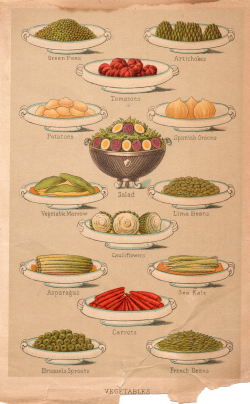
Perhaps Mrs Beeton is best known for her recipes, although most of them are not original. She was possibly the first person to include a comprehensive index at the front and to cross-reference the entries. The inclusion of cooking times and listed ingredients first, before the method, was also innovative albeit derided by ‘proper’ cooks who maintained one should always read through the recipe in full anyway. Beeton's Book of Household Management was the first British cookery book to use colour plates (in 1861) to show readers exactly how the food should look when it came to table.

Another 100 pages of the biography remain after Isabella’s death, reinforcing the idea that she and Sam were Mrs Beeton between them, and that the reputation which was built up around her had very little to do with the woman herself. It made sense for the publishing company to “pretend that Mrs Beeton was alive, well, and looking forward to supplying the nation with yet more words of wisdom from her immaculately-run home.”