Showing posts with label Art Gallery of New South Wales. Show all posts

Friday, 30 January 2026

Friday Five: Cultural Activities on Australia Day Weekend in Sydney

We went to Sydney for 48 hours over Australia Day weekend and we packed a lot in. I shall write more about each of these activities, but these are the headlines. 


1. Woolloomooloo Sculpture Walk - ARTPark Australia: This is a free public exhibition of outdoor large-scale sculptures made from materials such as stainless steel, bronze, concrete and wood. The sculptures sit along the Wharf Boardwalk and many contain allusions to environmental and sustainable themes.


2. Nick Cave and the Bad Seeds at The Domain: The reason we went to Sydney in the first place, Nick Cave excels again in the Wild God tour. Him Outdoors is a big fan of the Bad Seeds era (he likes The Birthday Party best but it is unlikely they will ever tour that material). We were more than happy to enjoy a two-and-a-half hour set, including new tunes and old favourites as the bats flew overhead in the night sky.


3. Art Gallery of New South Wales: We went to two exhibitions here. The first, Dangerously Modern: Australian Women Artists in Europe 1890-1940, featured celebrated and rediscovered paintings, prints, drawings, sculpture and ceramics. The more than 200 works represent the wave of women artists who prevailed against social constraints and left Australia to pursue international professional careers. Some returned bringing back new ideas - realism; impressionism; post-impressionism; cubism; abstraction - and playing an integral role in modernising Australia. Artists such as Nora Heysen, Grace Cossington Smith, Margaret Preston, Dorrit Black, Frances Hodgkins, Thea Proctor, and Hild Rix Nicholas are represented in all their explorations of colour, light, form and movement. 


The second exhibition, The Patchwork Portal, is a newly-commissioned work by Raquel Caballero. Celebrating craft as a skilled art, she invites visitors to contribute to a collaborative patchwork installation. She takes inspiration from her favourite childhood book, L Frank Baum's The Patchwork Girl of Oz, and the psychadelic fabrics of the 1970s are highlighted throughout her works of sculpture and portraiture.  


4. The Book of Mormon at Capitol Theatre, Sydney: I have wanted to see this musical for a while and, seeing it was on its last weekend in Sydney, I was delighted to secure reasonably-priced tickets for pretty good seats. The theatre itself is beautiful and the show was as irreverent and as entertaining as I could have hoped. Parodying everything from virtue signalling and whitewashing to organised religion and musical theatre itself, the production was high-energy and full-on camp with exceptionally tight vocals and choreography, and even a perfectly pitched musical-within-a-musical.


5. The Australian Museum: Again, we saw two exhibitions here, the first being Relics: A New World Rises in which vintage objects meet miniature Lego brick worlds. The concept is that in the future, the human race has disappeared leaving their detritus behind from fridges and typewriters to ATMs and jetskis. The Lego community has colonised them to make a cryogenic health centre, printing press, credit union and holiday resort. The exhibition aims at being both nostalgic and thought-provoking, but there are far too many children present, who have no concept of stepping back to let others see, and what with all the pushing and shoving, it is difficult to get near the displays.


The Australian Geographic Nature Photographer of the Year displays are always excellent and this is no exception (although it is next to the Lego exhibition and there is a spill-over of space-oblivious children). The works showcase the spectacular flora, fauna and landscapes found throughout Australia, New Zealand, Antarctica and New Guinea. "From murky ocean depths, to soaring mountain tops and fiery outback landscapes", they invite us to see nature "in a whole new light".

Glacial Blue by Stuart Chape

Thursday, 10 October 2013

Australian Galleries 3


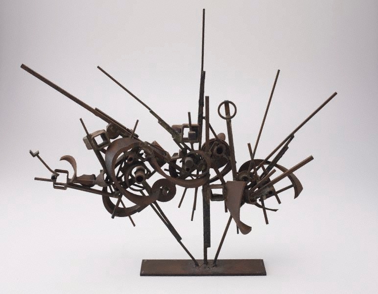
Metal Construction 123 - Robert Klippel
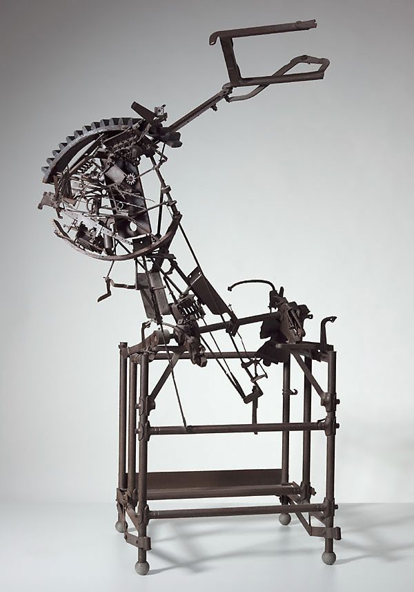
With a career spanning six decades, Robert Klippel was one of Australia's leading sculptors. His work investigates the realtionship between the organic and the mechanical; a duality that he saw as central to life and culture in the twentieth century. He took night-courses in arc-welding, silver soldering and panel-beating to acquire new skills.

In 1957 he moved to New York where he explored the unlimited 'vocabulary of shapes' available in junk metals. Using detritus - the chance fragments of modern disposable society - he created complex configurations with new life and meaning. By the late 1960s he had begun to shift his emphasis from using primarily machine parts to steel sections. Klippel aimed to synthesise sculpture and landscape and bring nature and technology together.

Metal Construction 202 (1966) - Robert Klippel
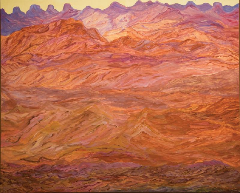
Angelina George paints the most amazing expansive canvases of her home land where she grew up and remembers when she used to walk about with her brothers and sisters or her mother. In the series of Dry Season paintings, she says she has worked from memories and imagination so it is 'not exactly what it looks like. You know. Traditional way and law.'

The sharp cliffs and rugged rocks hide billabongs and creeks where they find fish and birds. She says, 'we had to find our own tucker and we knew where to go hunting.' The spectacular landscape formations and shadows in these paintings are barren, bleak and beautiful with the sky forming only a tiny fraction of the canvas - the remainder is comprised of reds, oragnse, purples and distant greens. There is clearly life, if you know where to look.

Untitled (2008) - Angelina George
 When Ben Quilty first asked legendary painter Margaret Olley to sit for him, she said no. 'Her lack of ego is so appealing. Margaret didn't understand why anyone would want to see a portrait of her.' Fortunately, she relented and this amazing portrait in which paint sticks out in great blobs and swathes to create a fantastically piercing expression, won the Archibald Prize in 2011.

Margaret Olley (2011) - Ben Quilty
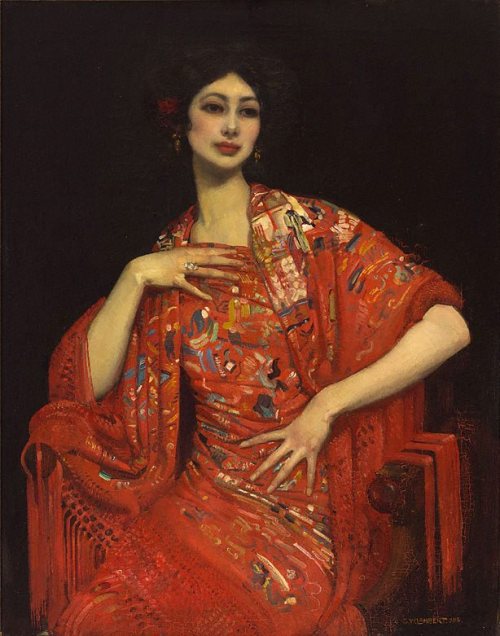
George Lambert's work is also a study in texture. In The Red Shawl, the material in its form and colour seem to be more important than the sitter. Another subject is caught in the act of removing her glove in Miss Helen Beauclerk and again, the detail paid to the fabric and the stitching of the material suggests the work of a fashion designer as much as a portrait painter.

The Red Shawl (1913) - George W. Lambert

Miss Helen Beauclerk (1914) - George W. Lambert
A third 'portrait' that caught my eye was Important People. Lambert suggested an allegory in his grouping of a flower-seller, a clerk and a boxer. He felt it should not only be the wealthy who get their portraits painted and that his work represented motherhood, the future generations, the fighting forces of the world and administrative qualities, without which the world (symbolised by the red cart wheel) would not turn smoothly.

Important People (1914-21) - George W Lambert
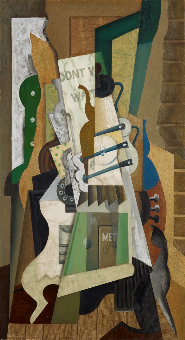
Eric Wilson studied abstract design and cubist philosophy on his travels to London and Paris. In Abstract- the kitchen stove he uses a domestic object to explore formal elements such as colour, shape, surfacing pattern and texture. The painting is structured around a triangular composition and demonstrates his attempt to create an 'orchestration of the formal elements into a symphonic whole'. The image also recalls domestic harmony in a musical instrument such as a lute or a cello.

Abstract- the kitchen stove (1943) - Eric Wilson
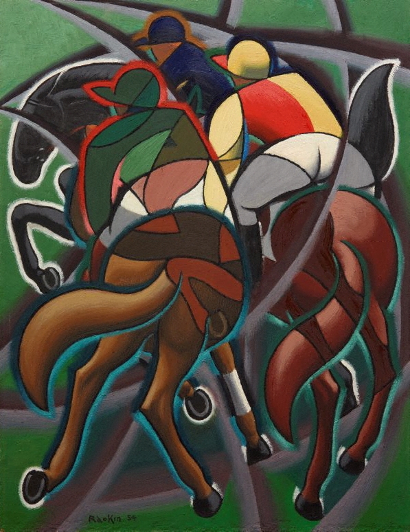
The cubist forms of the racehorse and riders in Weaver Hawkins' Going Round, create an almost stained-glass window effect. Hawkins was a founding member of the Contemporary Art Society and, in the early 1960s, a founding member of the Sydney printmakers' group.

Going round (1954) - Weaver Hawkins
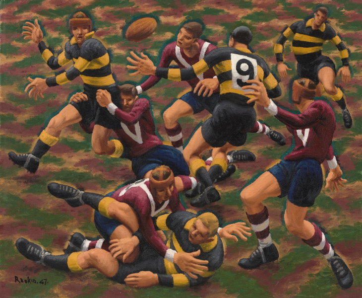
Hawkins' sporting works full of energy and movement assume another dimension when you realise that he was wounded in the Battle of the Somme and subsequently lost the use of his right hand and arm. He retrained himself to draw and paint using his left arm, which was never at full strength. From 1927 he began to use the alias 'Raokin' to avoid unwanted public and media perceptions about being an artist living with severe injuries after WWI. Almost as an antidote, the appreciation of the male form in all its rugged masculinity is on display in Dance of the Football Field, which depicts a rugby league match between Balmain and Manly.

Dance of the football field (1947) - Weaver Hawkins


Wednesday, 9 October 2013

Australian Galleries 2


Spring Frost by Elioth Gruner
According to visitor feedback, this is the ‘most-loved Australian landscape painting’ in the gallery. Elioth Gruner painted it in 1919 en plein air at Emu Plains. The cattle breath and morning shadows reaching out to the viewer, hark back to a rural nostalgia which was rapidly disappearing. The vigorous foreground brushwork and the sense of light and tone create a wistful world worth fighting for.

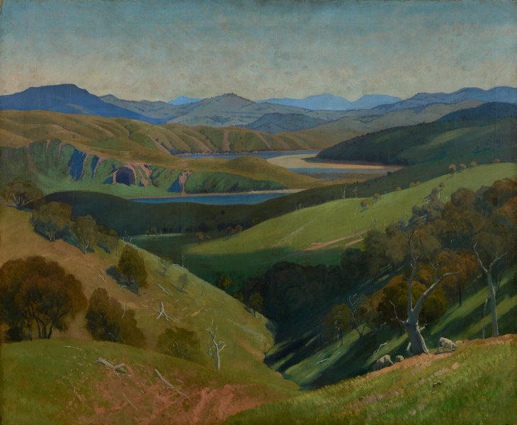
I also like his later work, which is more severe in form and outline. By emphasising the subtle harmonies of tone and colour, he creates a feeling of stability and permanence in contrast to his former exploratons into the evanescence of light. These organised pictures are more scientific and less emotional, but the landscape is familiar to me, with the sweep of hills to the valley river corridor, being the view from the back of our house.

On the Murrumbidgee (1929) - Elioth Gruner
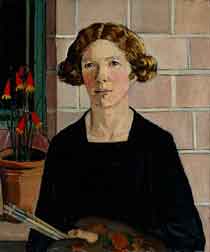
I love Nora Heysen's work from her still lifes to her war paintings and her self-portraits. Nora Heysen’s self-portrait strongly articulates her identity and ambition as a young artist, independent of her famous artist-father Hans Heysen. Characteristic of her 1930s’ paintings, Self portrait is powerfully composed with precise, strongly defined forms and earthy colours recalling European masters of the early Renaissance. After undertaking study in Europe, Heysen established herself as a distinguished portrait and still-life painter. In 1938 she won the Archibald Prize, the first woman to have done so." - from the Art Gallery of New South Wales' website.

This particular portrait was painted in her father's studio (which we have visited), with the Vermeer prints on the walls. Nora wrote, "I greatly admired Vermeer’s works and wanted to paint like him – perhaps Vermeer and my father were my biggest influences in those days …"

Self Portrait (1932) - Nora Heysen
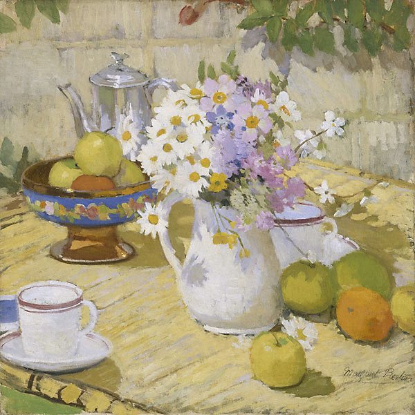
Margaret Preston is another favourite, and the development of her art and style is quite fascinating. Her still lifes are spectacular, including Summer and Still life with daisies and teapot, both painted in 1915. On 25 April 1915 Australian and New Zealand Army Corps landed on the Gallipoli Peninsula in Turkey, an action that came to signify Australia's emrging nationalism. At the time Preston (nee McPherson) was in England, whence she had moved from Paris after the outbreak of war. Despite the horror and trauma she encountered - she taught pottery and basket-weaving to shell-shocked soldiers - she continued to paint pleasant and cheerful still lifes.

Summer (1915) - Margaret Preston
In Still life wth teapot and daisies, the flat white sands of Bunmahon places the table firmly outside as its pink striped cloth manipulates the viewer's eye around and back to the central construction of bowls, flowers and teacups so diminishing an artificial perspective that would be created if the stripes travelled into depth.

"Her engaging play with reflections, a device she returned to throguhout her long painting career, shows another landscape mirrored in the teapot. A hammock of pink cradles a solitary figure in a long dress holding a parasol ad standing in a green field with a blue sky, so introducing a human element to the painting's design. The figure could be the viewer or a partaker returning to the afternoon tea."

Still life with daisies and teapot (1915) - Margaret Preston
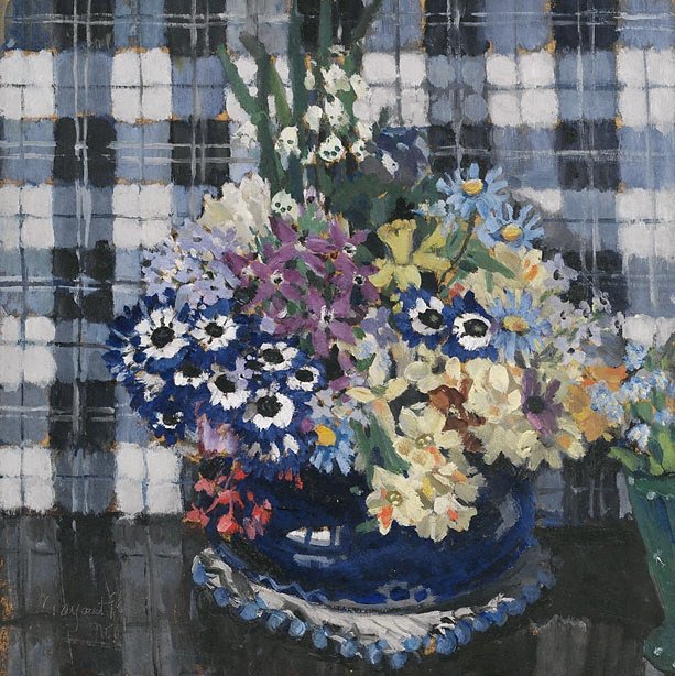
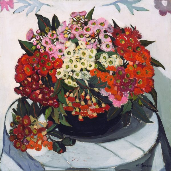
The difference between Flowers and Australian gum blossom shows the dvelopment and future direction of Preston's work. Although she still painted flowers, she chose to embrace local flora and a less formal approach with confidence.

Flowers (1922) - Margaret Preston

Australian gum blossom (1928) - Margaret Preston
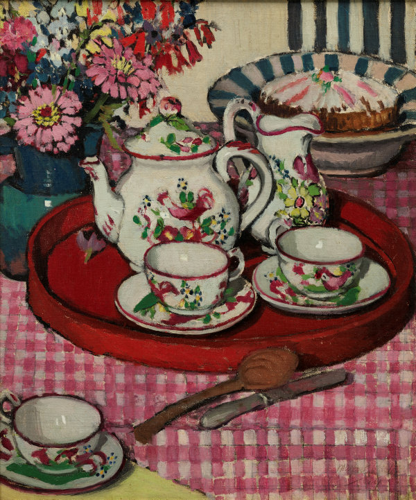
In between, she also ventured into stylised groupings, such as in Thea Proctor's Tea Party. This painting belongs to the genre of still life, but it is also a kind of portrait. It is a symbolic rendering of the things that Thea Proctor stood for. Preston encapsulates her fellow artist's belief in the importance of surrounding one's self with objects of taste and beauty, and alludes to her enthusiasm for arranged flowers in domestic settings, something the two artists shared.

The Proctor's tea party (1924) - Margaret Preston
Meanwhile, Implement blue is one of Margaret Preston’s most innovative works, embodying the values of progressive, modern living. She felt that this was a mechanical age – highly civilised and unaesthetic. Impersonal inventions were introduced to make home-life easier, but she felt detached from domesticity.

The restricted palette and strict analysis of form in this painting reveal how she turns to the genre of still life to express her conceptual conflict. The domestic vessels have been renamed 'implements' and reduced to essential forms.

Implement Blue (1927) - Margaret Preston
One of her most famous works is her 1930 Self Portrait, painted as a commission at the request of the Trustees of the Art Gallery of New South Wales. She later said, 'my self-porrait is completed, but I am a flower painter - I am not a flower." And yet, she has painted this image with the same attention to detail she brought to her still-lifes, incorporating the essentials of her art: her brush and palette and a pot of wildflowers.

Self Portrait (1930) - Margaret Preston
 Grace Cossington Smith’s The sock knitter has been acclaimed as the first post-impressionist painting to be exhibited in Australia. The extreme flattening of the picture plane and the use of bright, expressive, broken colour applied in broad brush-strokes to delineate form reflects the aesthetic concerns of European painters such as Cézanne, Matisse and van Gogh.

The subject of the painting is Madge, the artist’s sister, knitting socks for soldiers serving on the frontline in World War I. Distinctly modern in its outlook, The sock knitter counterpoints the usual narratives of masculine heroism in wartime by focusing instead on the quiet steady efforts of the woman at home.


The sock knitter (1915) - Grace Cossington-Smith
 In 1920 Cossington Smith was in the city when she noticed a crowd gathering. As she recalled: ‘I didn’t expect him to be there. I was in Martin Place and wondering why all the people were gathering, and someone said, “The Prince of Wales is going to drive by”. I was very excited and stood on the pavement and got an impression of it … then I think I made drawings of the buildings – a drawing rather – just to get it right. But I couldn’t while he was going by because it was only a few seconds, so I had to impress it on my mind’.

The Prince (1920) - Grace Cossington-Smith
I also love the painting of Reinforcements, troops marching for the use of the lines and colour which create an upright sense of movement - you can almost hear the boots hitting the ground in unison. The women in their hats waving handkerchiefs to the men and turning their backs on the brawling brat on the ground also speaks volumes to me. There are moments when individual wants are less important than communal needs.


Reinforcements, troops marching (1917) - Grace Cossington-Smith


Inspired by the art deco designs and vivid colours of the David Jones department store cafe in Sydney,  The Lacquer Room embodies the modern inter-war urban experience. The rich red and scattered patterns of the chairs are contrasted with the gleaming green of the lacquered tables, set against the brightness of the walls and polished floors. Grace Cossington Smith’s bold approach to colour exudes a sense of celebrating the new, similar to the contemporary consumer culture epitomised by the department store.

In an interview, she said, "It was quite a surprise, I didn't know it was there, but I went down to get cup of tea … and found this lovely restaurant … I was struck by its colour and general design the moment I saw it … Scarlet, green and white held me spellbound..."
 
The Lacquer Room (1935-36) - Grace Cossington-Smith
Ethel Carrick painted vivacious impressionist-influenced European landscapes, market scenes and flower pieces. After studying in London early in the 20th century, Carrick settled in Paris in 1905 where she became actively involved with women’s painting societies. She travelled extensively with her artist-husband, E Phillips Fox, in France, Italy, Northern Africa and Spain.
After Fox’s death in 1915, Carrick lived mostly abroad, travelling in Europe, painting in Majorca, Egypt, Morocco, Tunisia and India, and in the 1930s living in Kashmir. Her paintings commonly displayed an interest in figures, objects and her surrounding environment, rendered as patterns of colour and light.

Flower Market, Nice (1926) - Ethel Carrick

Tuesday, 1 October 2013

Crossing the Line: 'Contemporary Art'

I love art. I love the whole concept of transmitting ideas through visual media. I spend a lot of time in art galleries, wandering about, looking and thinking and feeling. I often feel like that robot in Short Circuit who needed input, and I search for it such places. Obviously I like some stuff more than others – we all do. There’s nothing wrong with that. Art is largely subjective, and that’s completely acceptable and, in fact, what makes it so interesting.

Sometimes, however, I feel as though it is April Fool’s Day, and I find myself looking for the candid camera, such as at the Contemporary Gallery of the Art Gallery of New South Wales in Sydney. I realise some people might like this, and fair play to them, but for me there is a line and this is where I draw it. These really are the Emperor’s New Clothes.

If the explanation is more artistic than the execution, it is a failed project. The real artist is the curator or whoever has written this guff – the more you need to write; the less successful the artwork. Now, I’m all for words and words for all, and I agree that great art can be complex and evade easy interpretation; it can draw you in and make you think, but these particular pieces just made me laugh. And not in a good way. See for yourself.

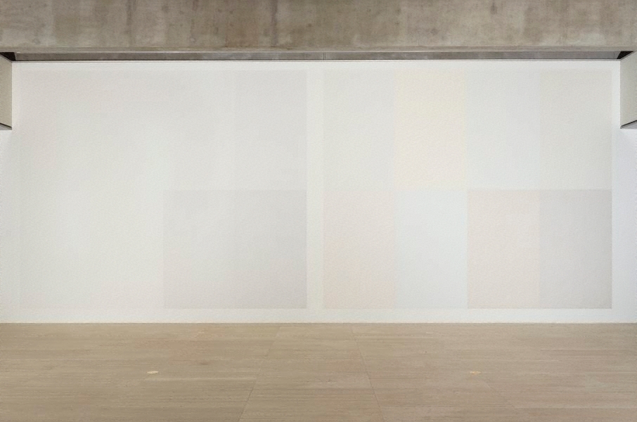
Wall Drawing #337 and Wall Drawing #338 by Sol Lewitt
Sol Lewitt has an artwork here called Rectangle Open: it’s a large white frame in the shape of a rectangle. Yup, that’s it.

His Wall Drawing #337 looks like a series of test paint colour spots on the wall, as a home rennovator decides which shade of magnolia they want in the hallway. Apparently they are created by ‘professional draughtspeople following Lewitt’s instructions’ thus making the instructions themselves the work of art. Seriously, that's what it says. 

The descriptor adds that the works are manifested by others – all are slightly different and no single work is the definitive version. The pretentious artist piffles on that it is ‘as though I am writing a piece of music and somebody else is going to play it on the piano.’ There are another 336 of these? They are certainly four-letter drawings beginning with 'w'. 

Canopy LI by Brian Blanchflower
Poor Brian Blanchflower is seemingly 'little known outside his native Perth.' Shame. Many more poeple could do with a laugh. The hapless viewer is instructed that these works (there are four of them) of oils on wax medium and pumice powder on laminated hessian exude energy in their technique.

The coarse thickness of paint on the support and then repeated gestures that both recede and deepen, and the layering of pigments, visually swell the material surface. The effect of the paintings is meant to be similar to the under-painting of Monet’s late water-lilies, as the angle of the light is reflected from the surface to reveal structures and grids embedded in the layers of paint, as you move around the room.

Pictorially the images map out the rhythm of time passing with marks, gestures and colour. The multiple layers of colour and mineralised paint suggest geological accretion. Metaphorically they chart the passage of the heavens or the earth; “this expression of the void in the earth, of being and nothingness, invokes the horizon where consciousness and materiality lightly touch.”

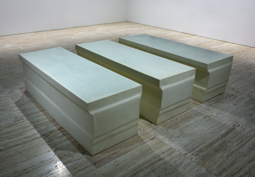
Untitled (elongated plinths) by Rachel Whiteread
"Rachel Whiteread is known especially for her negative casts of domestic spaces, in which she turns empty space into a solid. Here she has cast the plinth forms in the negative from a classically moulded silhouette of a dado that has been stretched to make a positive form the size of a bed or a mortuary slab. They are exactly the right size to be containers for the human body and could easily be read as sarcophagi.

"In addition to being made strange by elongation, the material is a semi-opaque white plastic over foam, which has an oddly ambiguous materiality. From a distance it could be marble, reinforcing the tomblike appearance. At close quarters, however, the light seems to be within the objects, or passing through them. This apparent transparency or luminosity makes them very mysterious, like the cryogenic containers so often represented in science fiction movies."

Thursday, 19 September 2013

Sides of Bacon: 3. Back

Francis Bacon: Five Decades
Art Gallery of New South Wales
17 November 2012 - 24 February 2013

Three Studies for Portrait of Isabel Rawsthorne
Frnacis Bacon embraced the triptych form, which gives many of his portraits the sensibility of mug shots with their front and two profile aspects. This was a format popular with devotional works and Christian altarpieces, which Bacon subverted, placing the secular (and what some considered ‘deviant’ images of homosexuality) in a religious arrangement designed to shock. This stylistic device also allowed him to construct a narrative through consecutive frames. Of Three Studes for Portrait of Isabel Rawsthorne he wrote “What I want to do is distort the thing far beyond the appearance, but in the distortion to bring it back to a recording of the appearance.”

Many of his triptychs are of George Dyer as he appears to work out his grief and anger on canvas. Three Studies of Male Back (1970) reveal a man reading or shaving reflected in a mirror, except in middle picture the mirror is symbolically a dark void. The figures in Triptych (1970) echo earlier themes of wrestlers but now the protruding spine points to vulnerability and the swinging hammock with distorted shadow and no background highlights loneliness and isolation.

Three Studies of male back (1970)

Triptych (1970)
Triptych (August 1972) seems to be a memorial as the figures on the outside are seated on a wooden chair while the one in the middle is in a foetal position. The flesh melts in puddles of pink and lilac, representing life flowing out of the body as shadows seem to escape from the figure.

Triptych (1972)
Bacon’s paintings of this period often feature mirrors and we see backs of heads and people examining themselves. He was also keen on radiology in this era, with its textbook blue circles pinpointing internal workings. In Triptych, 1973 there is an element of self-portraiture, of a figure looking critically at himself, at who and what he is. He examines his bodily functions (defecating and vomitting) and his inner demons. He claimed, “The sitter is someone of flesh and blood and what has to be caught is their emanation” but he often portrays his figures as though through glass tables with pornographic and sadomasochistic overtones.

Triptych (1973)
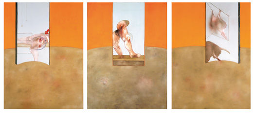
By the 1980s the sense of chaos and drama is replaced with a more sober control. Most of his friends were dead, and his paintings have become flat yet vibrantly coloured with solid, fleshy shadows. By 1987 the Triptych reveals bullfighters’ wounds as if seen through a blue window against a bright orange background.

Triptych (1987)
Francis Bacon’s work is puzzling both figuratively and literally. Confusion is created by his use of generic titles, renaming paintings with different titles, destroying of canvases, and inability to predict how many pictures he will exhibit so they cannot be included in a catalogue but arrive at the gallery with the paint still wet. Pictures of his studio reveal an overwhelming muddle and yet he insisted plaintively, “I work best in chaos”.

Perry Ogden's photo of Francis Bacon's studio


Wednesday, 18 September 2013

Sides of Bacon: 2. Middle

Francis Bacon: Five Decades
Art Gallery of New South Wales
17 November 2012 - 24 February 2014

Study for Self Portrait (1963)

In the 1960s Francis Bacon seems to have turned his attention to portraits, although they are not always flattering, or even recognisable. He claimed, “In trying to do a portrait, my ideal would really be just to pick up a handful of paint and throw it at the canvas and hope that the portrait was there.” He used flat, high key colour used to frame and isolate, with a few wild strokes and turns of the brush to create detail.

His 1963 Study for Self Portrait is a study in distortion; he is trapped by a blue sofa and his eyes are hollow sockets. The sofa makes a reappearance in Portrait of Henrietta Moraes on a blue couch (1965). A transfigures shape reclines on a blue sofa, barely covered with a white sheet and a strong suggestion of blood. Behind her a naturalist door opens onto a dark void, with all manner of possible interpretation – none of them pleasant. According to her obituary she was, ‘foul-mouthed, amoral, a thief, a violent drunkard and a drug addict. Yet she was witty, wonderfully warm and lovable.”

Portrait of Henrietta Moraes on a blue couch (1965)
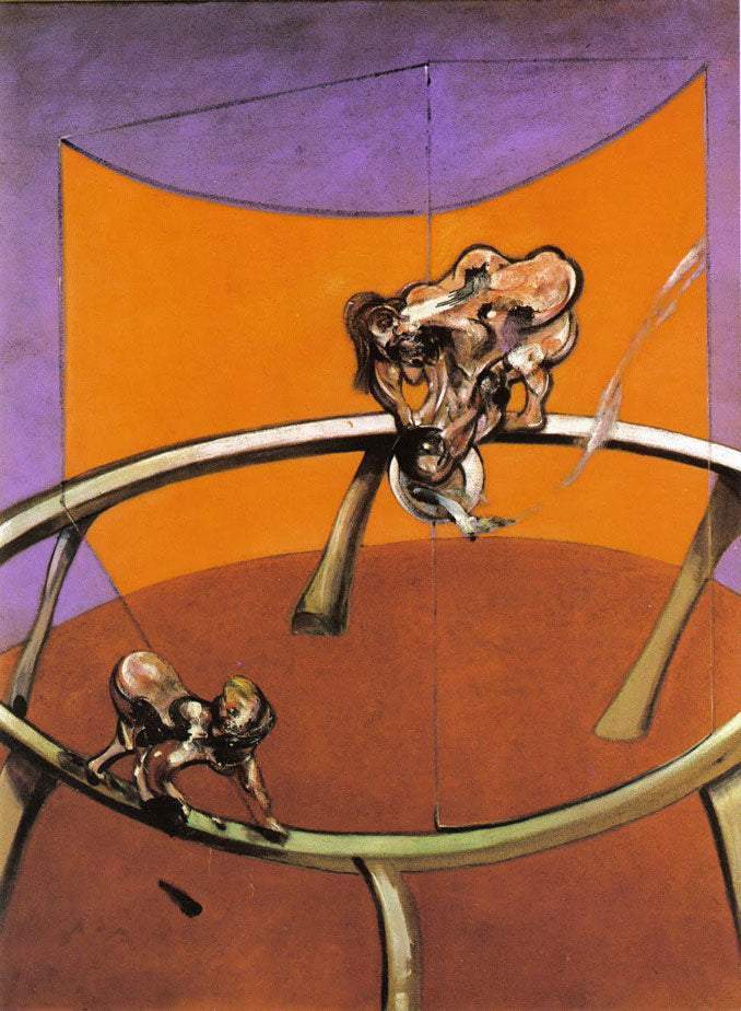
His use of blocking and perverting the colour wheel (thirds of red, orange and purple like a geography teacher’s wardrobe) are startling in From Muybridge: the human figure in motion; woman emptying a bowl of water; paralytic child walking on all fours (1965). Eadweard Muybridge was an English photographer known for pioneering motion series, and this work suggests a 3D model with moving figures.

From Muybridge (1965)
The Portrait of George Dyer in a Mirror 1967-68 shows Dyer, Bacon’s lover, sitting in what looks like a swivel office chair, his disembodied face, split down the centre, reflected in a lectern-like stand. On the painting are two splurges of white paint splashed across the surface reminiscent of semen defacing the image. Whether this indicates rage, lust, or possession, it is highly confrontational to the viewer. In 1971 Dyer committed suicide in a hotel room on the eve of Bacon’s major retrospective at the Grand Palais in Paris.

Portrait of George Dyer in a mirror (1967-68)
At first glance, Lying Figure (1969) reminds me of a fried egg in a skillet – the colours correspond. On closer inspection it is a naked female figure, Henrietta Moraes, splayed on a bed with a syringe in her arm and drugs on a sideboard. There is more than a suggestion of violence and the ‘nailed to the wood’ parodies the crucifixion. The position of the model, bleak light and floating bed hint at a dissection on an operating table or perhaps another type of theatre, dramatically arranged to resemble an artist’s palette.

Lying Figure (1969)
In later works, Bacon introduced props such as umbrellas and cricket pads. Seated Figure (1978) is a depiction of George Dyer with these symbols. The triptych Studies of the human body depicts three versions of a (headless) woman on rail or tightrope with an umbrella for possible balance. The lean minimal composition highlights a writhing, convulsing figure on a clean ground of flat colour. And Figure in Movement (1985) focuses on a faceless batsman ready for action. Bacon refused to explain the cricket pads but merely said he acknowledged the importance of the game to the British psyche and coyly added that he was interested in sport of all types and the male form in action.

Seated Figure (1978)
Studies of the human body
Figure in Movement (1985)