Friday 11 October 2013

Friday Five: Cheap as chicken

I like chicken as much as the next person. Or at least, I thought I did, until I moved to Australia, where it seems that the average person likes chicken a lot.

Australia has the second highest number of sheep in the world (after China) and yet lamb is quite expensive here. Australia is the seventh largest cattle rearing country in the world, but beef is still pretty pricey. Australia doesn't even make the top ten of national poultry producers, but chicken seems to be the choice meat of the country. This extends to the number of 'fast food chicken restaurants', of which there are many, without even resorting to the globally ubiquitous KFC.

5 Fast-Food Chicken Outlets in Australia:
  1. Nando's: originally South African, but it has been in Australia for the past 15 years.
  2. Red Rooster: first opened in Kelmscott, WA, this is now 'Australia's largest roast chicken operation'
  3. County Chicken: 'crisp and light with a taste just right', they also fry other stuff besides chicken, like fish.
  4. Henny Penny: mainly in NSW they describe themselves as 'quick service' rather than 'fast food' restaurants.
  5. Kingsley's Chicken: 'unbelievable value; awesome chips' apparently - they are a Canberra and Queenbeyan 'speciality'

Thursday 10 October 2013

Australian Galleries 3


Metal Construction 123 - Robert Klippel
With a career spanning six decades, Robert Klippel was one of Australia's leading sculptors. His work investigates the realtionship between the organic and the mechanical; a duality that he saw as central to life and culture in the twentieth century. He took night-courses in arc-welding, silver soldering and panel-beating to acquire new skills.

In 1957 he moved to New York where he explored the unlimited 'vocabulary of shapes' available in junk metals. Using detritus - the chance fragments of modern disposable society - he created complex configurations with new life and meaning. By the late 1960s he had begun to shift his emphasis from using primarily machine parts to steel sections. Klippel aimed to synthesise sculpture and landscape and bring nature and technology together.

Metal Construction 202 (1966) - Robert Klippel
Angelina George paints the most amazing expansive canvases of her home land where she grew up and remembers when she used to walk about with her brothers and sisters or her mother. In the series of Dry Season paintings, she says she has worked from memories and imagination so it is 'not exactly what it looks like. You know. Traditional way and law.'

The sharp cliffs and rugged rocks hide billabongs and creeks where they find fish and birds. She says, 'we had to find our own tucker and we knew where to go hunting.' The spectacular landscape formations and shadows in these paintings are barren, bleak and beautiful with the sky forming only a tiny fraction of the canvas - the remainder is comprised of reds, oragnse, purples and distant greens. There is clearly life, if you know where to look.

Untitled (2008) - Angelina George
 When Ben Quilty first asked legendary painter Margaret Olley to sit for him, she said no. 'Her lack of ego is so appealing. Margaret didn't understand why anyone would want to see a portrait of her.' Fortunately, she relented and this amazing portrait in which paint sticks out in great blobs and swathes to create a fantastically piercing expression, won the Archibald Prize in 2011.

Margaret Olley (2011) - Ben Quilty
George Lambert's work is also a study in texture. In The Red Shawl, the material in its form and colour seem to be more important than the sitter. Another subject is caught in the act of removing her glove in Miss Helen Beauclerk and again, the detail paid to the fabric and the stitching of the material suggests the work of a fashion designer as much as a portrait painter.

The Red Shawl (1913) - George W. Lambert

Miss Helen Beauclerk (1914) - George W. Lambert
A third 'portrait' that caught my eye was Important People. Lambert suggested an allegory in his grouping of a flower-seller, a clerk and a boxer. He felt it should not only be the wealthy who get their portraits painted and that his work represented motherhood, the future generations, the fighting forces of the world and administrative qualities, without which the world (symbolised by the red cart wheel) would not turn smoothly.

Important People (1914-21) - George W Lambert
Eric Wilson studied abstract design and cubist philosophy on his travels to London and Paris. In Abstract- the kitchen stove he uses a domestic object to explore formal elements such as colour, shape, surfacing pattern and texture. The painting is structured around a triangular composition and demonstrates his attempt to create an 'orchestration of the formal elements into a symphonic whole'. The image also recalls domestic harmony in a musical instrument such as a lute or a cello.

Abstract- the kitchen stove (1943) - Eric Wilson
The cubist forms of the racehorse and riders in Weaver Hawkins' Going Round, create an almost stained-glass window effect. Hawkins was a founding member of the Contemporary Art Society and, in the early 1960s, a founding member of the Sydney printmakers' group.

Going round (1954) - Weaver Hawkins
Hawkins' sporting works full of energy and movement assume another dimension when you realise that he was wounded in the Battle of the Somme and subsequently lost the use of his right hand and arm. He retrained himself to draw and paint using his left arm, which was never at full strength. From 1927 he began to use the alias 'Raokin' to avoid unwanted public and media perceptions about being an artist living with severe injuries after WWI. Almost as an antidote, the appreciation of the male form in all its rugged masculinity is on display in Dance of the Football Field, which depicts a rugby league match between Balmain and Manly.

Dance of the football field (1947) - Weaver Hawkins


Wednesday 9 October 2013

Australian Galleries 2


Spring Frost by Elioth Gruner
According to visitor feedback, this is the ‘most-loved Australian landscape painting’ in the gallery. Elioth Gruner painted it in 1919 en plein air at Emu Plains. The cattle breath and morning shadows reaching out to the viewer, hark back to a rural nostalgia which was rapidly disappearing. The vigorous foreground brushwork and the sense of light and tone create a wistful world worth fighting for.

I also like his later work, which is more severe in form and outline. By emphasising the subtle harmonies of tone and colour, he creates a feeling of stability and permanence in contrast to his former exploratons into the evanescence of light. These organised pictures are more scientific and less emotional, but the landscape is familiar to me, with the sweep of hills to the valley river corridor, being the view from the back of our house.

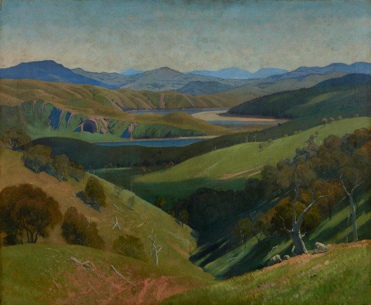
On the Murrumbidgee (1929) - Elioth Gruner
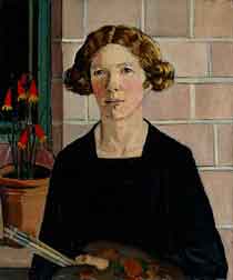
I love Nora Heysen's work from her still lifes to her war paintings and her self-portraits. Nora Heysen’s self-portrait strongly articulates her identity and ambition as a young artist, independent of her famous artist-father Hans Heysen. Characteristic of her 1930s’ paintings, Self portrait is powerfully composed with precise, strongly defined forms and earthy colours recalling European masters of the early Renaissance. After undertaking study in Europe, Heysen established herself as a distinguished portrait and still-life painter. In 1938 she won the Archibald Prize, the first woman to have done so." - from the Art Gallery of New South Wales' website.

This particular portrait was painted in her father's studio (which we have visited), with the Vermeer prints on the walls. Nora wrote, "I greatly admired Vermeer’s works and wanted to paint like him – perhaps Vermeer and my father were my biggest influences in those days …"

Self Portrait (1932) - Nora Heysen
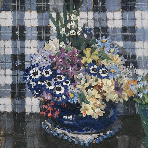
Margaret Preston is another favourite, and the development of her art and style is quite fascinating. Her still lifes are spectacular, including Summer and Still life with daisies and teapot, both painted in 1915. On 25 April 1915 Australian and New Zealand Army Corps landed on the Gallipoli Peninsula in Turkey, an action that came to signify Australia's emrging nationalism. At the time Preston (nee McPherson) was in England, whence she had moved from Paris after the outbreak of war. Despite the horror and trauma she encountered - she taught pottery and basket-weaving to shell-shocked soldiers - she continued to paint pleasant and cheerful still lifes.

Summer (1915) - Margaret Preston
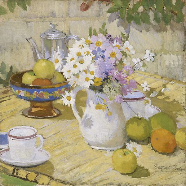
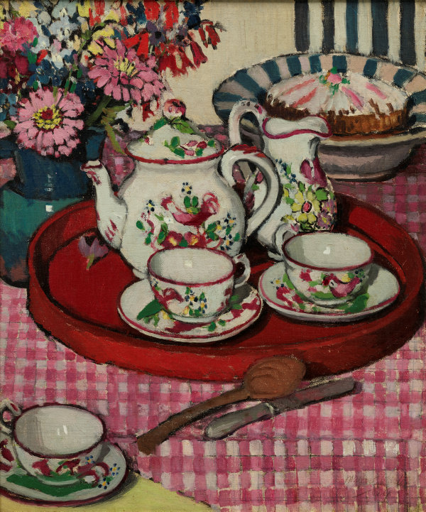
In Still life wth teapot and daisies, the flat white sands of Bunmahon places the table firmly outside as its pink striped cloth manipulates the viewer's eye around and back to the central construction of bowls, flowers and teacups so diminishing an artificial perspective that would be created if the stripes travelled into depth.

"Her engaging play with reflections, a device she returned to throguhout her long painting career, shows another landscape mirrored in the teapot. A hammock of pink cradles a solitary figure in a long dress holding a parasol ad standing in a green field with a blue sky, so introducing a human element to the painting's design. The figure could be the viewer or a partaker returning to the afternoon tea."

Still life with daisies and teapot (1915) - Margaret Preston
The difference between Flowers and Australian gum blossom shows the dvelopment and future direction of Preston's work. Although she still painted flowers, she chose to embrace local flora and a less formal approach with confidence.

Flowers (1922) - Margaret Preston

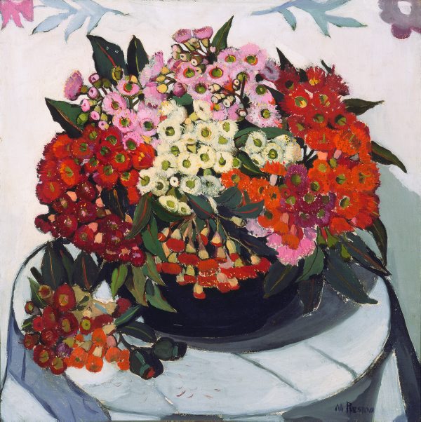
Australian gum blossom (1928) - Margaret Preston
In between, she also ventured into stylised groupings, such as in Thea Proctor's Tea Party. This painting belongs to the genre of still life, but it is also a kind of portrait. It is a symbolic rendering of the things that Thea Proctor stood for. Preston encapsulates her fellow artist's belief in the importance of surrounding one's self with objects of taste and beauty, and alludes to her enthusiasm for arranged flowers in domestic settings, something the two artists shared.

The Proctor's tea party (1924) - Margaret Preston
Meanwhile, Implement blue is one of Margaret Preston’s most innovative works, embodying the values of progressive, modern living. She felt that this was a mechanical age – highly civilised and unaesthetic. Impersonal inventions were introduced to make home-life easier, but she felt detached from domesticity.

The restricted palette and strict analysis of form in this painting reveal how she turns to the genre of still life to express her conceptual conflict. The domestic vessels have been renamed 'implements' and reduced to essential forms.

Implement Blue (1927) - Margaret Preston
One of her most famous works is her 1930 Self Portrait, painted as a commission at the request of the Trustees of the Art Gallery of New South Wales. She later said, 'my self-porrait is completed, but I am a flower painter - I am not a flower." And yet, she has painted this image with the same attention to detail she brought to her still-lifes, incorporating the essentials of her art: her brush and palette and a pot of wildflowers.

Self Portrait (1930) - Margaret Preston
 Grace Cossington Smith’s The sock knitter has been acclaimed as the first post-impressionist painting to be exhibited in Australia. The extreme flattening of the picture plane and the use of bright, expressive, broken colour applied in broad brush-strokes to delineate form reflects the aesthetic concerns of European painters such as Cézanne, Matisse and van Gogh.

The subject of the painting is Madge, the artist’s sister, knitting socks for soldiers serving on the frontline in World War I. Distinctly modern in its outlook, The sock knitter counterpoints the usual narratives of masculine heroism in wartime by focusing instead on the quiet steady efforts of the woman at home.


The sock knitter (1915) - Grace Cossington-Smith
 In 1920 Cossington Smith was in the city when she noticed a crowd gathering. As she recalled: ‘I didn’t expect him to be there. I was in Martin Place and wondering why all the people were gathering, and someone said, “The Prince of Wales is going to drive by”. I was very excited and stood on the pavement and got an impression of it … then I think I made drawings of the buildings – a drawing rather – just to get it right. But I couldn’t while he was going by because it was only a few seconds, so I had to impress it on my mind’.

The Prince (1920) - Grace Cossington-Smith
I also love the painting of Reinforcements, troops marching for the use of the lines and colour which create an upright sense of movement - you can almost hear the boots hitting the ground in unison. The women in their hats waving handkerchiefs to the men and turning their backs on the brawling brat on the ground also speaks volumes to me. There are moments when individual wants are less important than communal needs.


Reinforcements, troops marching (1917) - Grace Cossington-Smith


Inspired by the art deco designs and vivid colours of the David Jones department store cafe in Sydney,  The Lacquer Room embodies the modern inter-war urban experience. The rich red and scattered patterns of the chairs are contrasted with the gleaming green of the lacquered tables, set against the brightness of the walls and polished floors. Grace Cossington Smith’s bold approach to colour exudes a sense of celebrating the new, similar to the contemporary consumer culture epitomised by the department store.

In an interview, she said, "It was quite a surprise, I didn't know it was there, but I went down to get cup of tea … and found this lovely restaurant … I was struck by its colour and general design the moment I saw it … Scarlet, green and white held me spellbound..."
 
The Lacquer Room (1935-36) - Grace Cossington-Smith
Ethel Carrick painted vivacious impressionist-influenced European landscapes, market scenes and flower pieces. After studying in London early in the 20th century, Carrick settled in Paris in 1905 where she became actively involved with women’s painting societies. She travelled extensively with her artist-husband, E Phillips Fox, in France, Italy, Northern Africa and Spain.
After Fox’s death in 1915, Carrick lived mostly abroad, travelling in Europe, painting in Majorca, Egypt, Morocco, Tunisia and India, and in the 1930s living in Kashmir. Her paintings commonly displayed an interest in figures, objects and her surrounding environment, rendered as patterns of colour and light.

Flower Market, Nice (1926) - Ethel Carrick

Tuesday 8 October 2013

Australian Galleries 1

"Painting is an argument between what it looks like and what it means" - Brett Whiteley
Having been confounded by contemporary art in the Art Gallery of New South Wales, I reassured myself with work that I actually like. Each time I come to Australian art galleries I familiarise myself more with local artists, themes and styles. I have just included in this post some of my favourites.

Whiteley's return to Australia in 1969 heralded a new preoccupation with colour and beauty. Inspired principally by Matisse, but also by his house at Lavender Bay on Sydney Harbour's north shore, he created a series of large scale paintings of expansive interiors and views evoking the marine beauty of the harbour. I like this expansive blue canvas dotted with boats and the faint white line-drawing of the bridge.

The Balcony 2 (1975) by Brett Whiteley
John Olsen is possibly best known for creating the mural, Salute to Five Bells, in the Sydney Opera House, inspired by Kenneth Slessor's poem. He wrote of this painting:
"Five bells was my first commission to paint in situ to cover a wall … I didn’t hesitate. I brushed a line around the core theme, the seed-burst, the life-burst, the sea-harbour, the source of life. Inside and around this core, I painted images drawn from metaphors and similes in [Kenneth] Slessor’s poem of our harbour city, and from my own emotional and physical involvement with the harbour, and with my young family in Watsons Bay …I wanted to show the Harbour as a movement, a sea suck, and the sound of the water as though I am part of the sea ... The painting says directly what I wanted to say: ‘I am in the sea-harbour, and the sea-harbour is in me’." - John Olsen
Five bells (1963) - John Olsen

John Brack uses repeated angular forms for his painting of a woman mid-conversation. Communication is usually a positive thing but in this sepia tinted rendition it is strained and isolating. The viewer, positioned as a direct and close observer, is drawn into the stark geometry of the composition.

The Telephone Box (1954) by John Brack
Arthur Boyd's Nebuchadnezzar on fire falling over a waterfall features a bright meteor plunging toward a waterfall in the Austalian bush, with its distintive greens, olives, blues and yellows. The figure's splayed fingers recalls the Old Testament punishment of Nebuchadnezzar who was punsihed by God by being driven insane, ‘his nails like birds’ claws’ (Book of Daniel). There are further similarities with both the legend of Icarus and the self-immolation of Vietnam War protestors.

Nebuchadnezzar on fire falling over a waterfall (1966-68) by Arthur Boyd
"With its startling blue eye conveying fear, pain and a desperate struggle for freedom, Hare in Trap is powerfully autobiographical. Nolan himself suggested that the hare’s eyes relate to an incident during a car trip to northern Victoria, when the painter and his father came across a hare caught in a trap – the resultant look in his father’s blue eyes struck Nolan vividly. This beautiful, enigmatic painting, which can be read as a self-portrait, is revered universally by scholars and Nolan’s admirers as one of his finest masterpieces."


Hare in Trap (1946) - Sidney Nolan
First-class marskman shows the isolated figure of Ned Kelly in the solid black armour that is Nolan’s most inventive pictorial device, its flat abstracted shape incongruously placed against a landscape of lyrical delicacy. The title refers to an incident which took place in Victoria’s Wombat Ranges, when Kelly and his gang were practising their marksmanship, firing hundreds of rounds at surrounding trees from a bullet-proof hide-out.

First-class marksman (1946) - Sidney Nolan
Albert Tucker, friends with Sidney Nolan, was impressed with the photographs the latter brought back from the 1952 Queensland drought. Many of them show the harsh effects of the climactic conditions in dessicated carcasses.
Apocalyptic horse (1956) - Albert Tucker
Faun attacked by parrot 3 is a direct reference to Nolan's style, with the exposed ribs and square head against the bleak landscape of burnt tree trunks echoing the paintings of the Ned Kelly series. The bright-feathered parrot, however, with the 3D beak and quirky face is typical of Tucker.

Faun attacked by parrot 3 (1968) - Albert Tucker


Sunday 6 October 2013

Quote for today: And the point is...


Reading Aloud - Julius LeBlanc Stewart
"The point of a story is that it is that, a story, not a tract developing a moral. It is itself and it tells you." - Marion Halligan, The Apricot Colonel